Are you new here? I recommend learning who I am and what this site is about. You should also check out the last two challenges here and here.
The Challenge
I attend a meeting once a month with fellow entrepreneurs #IRL. It was there I met Doug Hill, a primitive skills educator.
He teaches local Coloradans how to survive in the mountains, build fires, and make their own bows and arrows. How fucking cool is that?
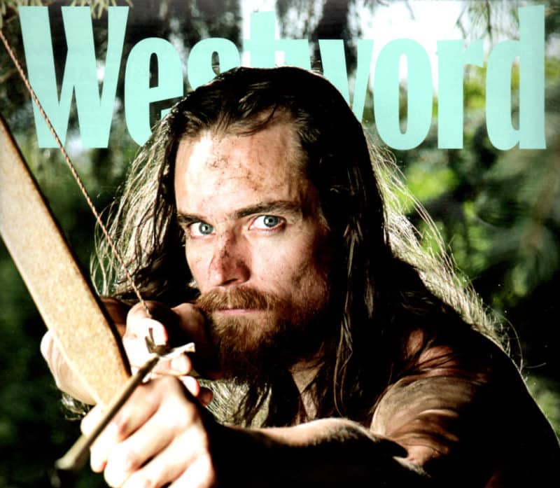
This is Doug on the cover of Westword, which is popular magazine in Denver, Colorado. Photo by Anthony Camera.
We became fast friends. It turns out we both used to live a few towns apart in New Jersey and have a mutual friend from back home.
He’s trying to shift his in-person business (Gone Feral) to the online space by offering video courses. He’s is a filmmaker too, so his videos look amazing. And because of his background in eduction, he packs them with information.
Doug and I are teaming up to build an ironic product: an online membership training library and community dedicated to teaching survival, bushcraft, and primitive skills.
We have only 14 days to build and launch on February 14th 2017.
What We’re Building?
The plan is to build a massive WordPress site to hold both the membership platform AND the front-end site for content marketing. The site will be located at GoneFeral.org and the membership side will be called “The Pack.”
The goal of this challenge is to build a minimum viable product (MVP), launch, and get paying customers in just 14 days. Over time (while gathering feedback from members) we’ll add new features, courses, and continue to grow.
My favorite version of this idea is a product called Fizzle – video business training for independent entrepreneurs. I’ve been a member since its beginning, and admired how they ran it.
Currently, Doug’s site (GoneFeral.org) is built and hosted on SquareSpace. I’m moving the site and content to WPEngine. I’ll be completely redesigning the site.
NOTE: Because this is a subscription-based membership site, there needs to be a reason for people to keep coming back. Some ideas would be:
- Adding at least one new course/module every month.
- Holding weekly or bi-monthly live webinars for members on specific topics.
- An active community forum to keep up on the trends and sharing ideas.
- Additional perks for members including discounts for products.
- Video/Audio interviews with other primitive skills experts.
What We’re Starting With
Doug has been in business for five years, but his online presence is still in the early stages. Here are some stats we’ll be working with as of February 1st 2017:
- GoneFeral.org receives an average of 606 visits and 1,365 pageviews a month.
- 592 subscribers in a free Mailchimp account.
The membership platform will include 59 video lessons. Doug has some of these videos filmed and edited already. He’ll be working on filming and editing 24 additional videos before launch.
Here’s an example of video lesson on making pitch glue: nature’s expoxy.
Of course, I have over 10 years of experience coding and designing Wordpress sites from scratch. I’ll be using some existing code from my other projects to speed this up. I have elements from themes I’ve built in the past that I can re-use on this site.
Also, I’m in the middle of building ANOTHER membership site for my flagship brand, Swim University. During this challenge I’ll also be building and managing SwimUniversityPro.com – the beta version launches on March 1st 2017. I’ve already finished up most of the development and I can use some of the code for this project.
The truth is, I’ve laid a lot of the groundwork for this project. Most of my time will be spent designing. Gone Feral should look and feel different from my other projects. Mainly, I’d like to stick with an outdoor theme even when we reference standard web stuff. For instance, we like to call the forum “The Campfire” instead. Get it?
The Plan
The goal is to build a “beta” version of the site and membership platform, and get people paying as quickly as possible.
I’ll be in charge of the website, marketing, and other tech stuff. Doug will create the video courses and front-end blog articles – basically all the words and videos because I have no idea how teach primitive skills 🙂
On January 30th 2017 (two days before we officially begin this challenge), we paid for a new WP Engine and bought a copy of the Restrict Content Pro plugin ($199/year) which will handle all the membership stuff including:
- Payment processing using Stripe.
- Managing memberships.
- Restricting courses and lessons.
1. Design The Front-End Content Marketing Site
The first step is to quickly get GoneFeral.org off SquareSpace and on to WordPress so we can start using it to pre-launch the membership product.
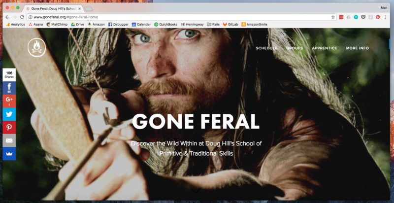
Current SquareSpace Version of GoneFeral.org
I’m going to use pieces of code from all my WordPress Theme designs to create a new site to host all of Doug’s current live workshops and blog posts. My main goal in this phase is to get something live in the first few days and start aggressively collecting emails for the launch of “The Pack.”
I’ll be designing, coding, and moving all the content over manually. I’m not using any import features because I want to clean things up as I go. I’m hoping to have this part done in about four days. Maybe even less if things go my way.
As soon as the website is fully designed, we’ll change the DNS records for GoneFeral.org (on GoDaddy) to the new site on WPEngine.
2. Build The Membership Platform
I’ll be customizing the shit out of the Restrict Content Pro plugin. It comes with a lot of built-in pages that I’ll be redesigning, including:
- Membership signup form with payment processing
- Login page
- Membership details and profile pages
I’ll be adding a few custom post types (via plugins I’ve already made) that’ll keep the paid content separate from the free blog content. For example, the membership content will be called “Lessons” and they’ll be grouped together by “Courses/Modules” or categories.

The plugin creates a custom post type that looks like this.
The membership site will include:
- The Den: a page listing modules and courses filled with video lessons on survival, bushcraft and primitive skills. Video hosting will be through a paid version of Wistia. This is the most costly service we’ll need starting at $100 a month.
- The Fire: a simple web forum on various outdoor topics using BBPress.
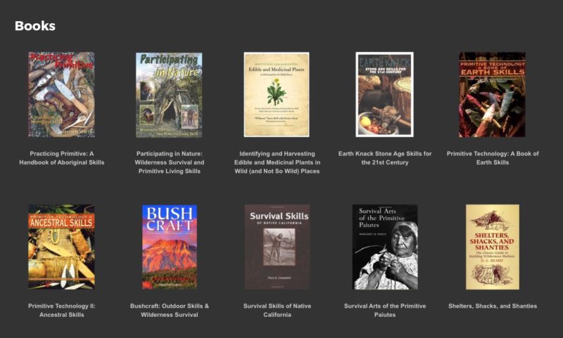
- Resources: a page filled with books, gear, and other helpful things.
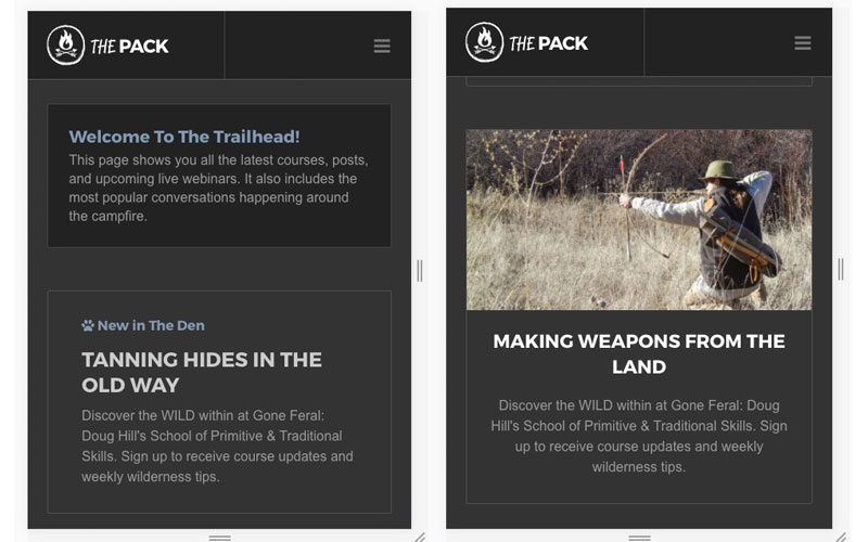
- Trailhead: This will be the dashboard listing announcements, new courses/modules, new blog posts, upcoming webinars, and popular forum topics.
3. Test The Front-End Site and Membership Platform
Once everything is built, Doug and I will have to make sure everything is working. That includes both the front-end marketing site and membership platform.
We’ll be using Stripe to collect payments via the Restrict Content Pro plugin. We’ll test user registration and logging in a few times to be sure it’s all working properly. I may even have some other people test this process for ease of use.
This stage is where we’ll try to find as many bugs as possible before we start working on the launch sequence. I like to be confident that all the technical stuff is in working order and ready for customers.
4. Set Up Sales and Marketing Content for “The Pack”
We have a few ideas on how to market “The Pack” before and after the beta launch. Here’s a list of ideas we’re going to try:
- Sales Landing Page: On the main front-end marketing website I’ll create a sales landing page for “The Pack”. This will be a long page detailing the entire product. I will build this page shortly after I finish building the platform and it’s been tested.
- Email Marketing: We have a small list of subscribers to send a few emails to. Also, everyone reading this post will know about it, too. I’m willing to bet some of you might be interested in this. That would be a nice surprise 🙂
- Contacting the press: Doug has some industry contacts who’ve reached out to him to be on TV shows and magazines. Hopefully we can get in touch with a few of these people to get some additional press about us building an online product to teach primitive skills. I think that’s a great story dripping with irony.
- Writing Blogs and Posting Videos: We will promote free blog content in order to attract people to signup. While we’re building the site, we probably won’t have time to create anything new, but Doug has some posts that could be improved and re-marketed on social media and the email list.
- Smart Bar and Popups: an easy way to push existing traffic into potential members using SumoMe.
If you have any other ideas that might work, please share them in the comments at the bottom of this post 🙂
5. Pricing and Beta Launch!
Membership to “The Pack” for the first two weeks it will have an introductory price of only $19 a month. If you sign up during that time, you’ll be grandfathered in at that price for as long as you stay a member.
There will be no limit to how many people enter during the beta launch. In fact, the more the better. I’m hoping we can get at least 50 people in the first two weeks.
During those two weeks, we’ll be aggressively promoting on social media and content marketing.
What do you think of this challenge so far?
Day 1: Setting Up The Front-End Website And Starting the Design
I didn’t get started until 11:30 am because I had some loose ends to tie up since it’s the beginning of a new month. On the first of every month, I update a bunch of business spreadsheets and what not.
When I finally got started, I wasn’t able to create any SFTP logins to WPEngine because they pushed an update and it caused some issues. I’m typing this because I’m sitting here waiting for things to be fixed. I can’t do anything until I’m able to login to the WordPress install and create a staging server to start designing.
This is just a slight bump. It’s not the end of the world, but I can feel the frustration bubbling up inside me. This calls for some fire emojis 🔥🔥🔥!!!
Creating an Action Plan
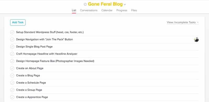
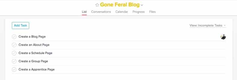
You know I love Asana, and I’ve joined Doug’s Asana team to keep track of my progress building the site. Here’s a quick screenshot of all my tasks I need to accomplish to get the signup and running quickly.
Of course, this task list always evolves, but this will keep me on track to finishing this design extremely fast.
The Navigation
It’s 1:00pm and I’ve finished setting up WordPress and designing the responsive navigation. I took most of the code from RoastyCoffee.com but added a few new elements.
A Single Blog Post
Whenever I design a website, I always start with what a single post will look like. These pages get seen more than any other page on the site.
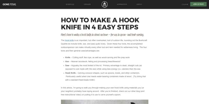
I took the code from Roasty again and just changed some fonts and colors around. Here’s what a single post looks like:
NOTE: Doug has not seen this design yet. He’s been out teaching all day. So things may change once he gets a peek. But for now, the design is really coming along nicely. And swift!
The max width of the post is 800px in case you were wondering. All of my sites, except SwimUniversity.com (for now) are at the same width. Makes it easy to read and adjust for mobile.
The Homepage
I’m proud of myself for designing this. It turned out really well. I also want to point out that there was really no planning with this design. I had a few days of it swirling in my head, but I didn’t template it or draw anything before coding this.
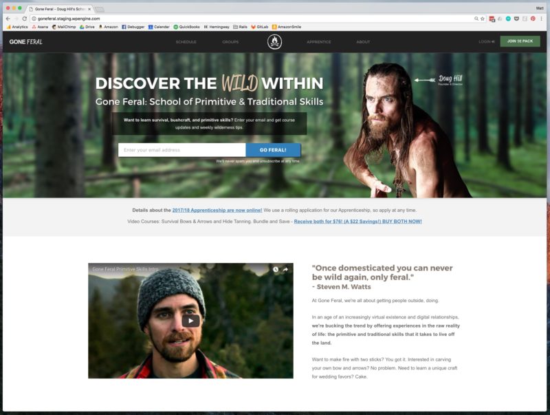
I had an idea and just ran with it. I coded and tweaked until it looked right. I finished the homepage around 6pm. And there’s STILL some changes I’d like to make. But here’s where we’re at:
The homepage is also fully responsive. I decided to code the responsive stuff while designing. Usually I wait until a site is completely coded before I tackle the responsive stuff, but not this time.
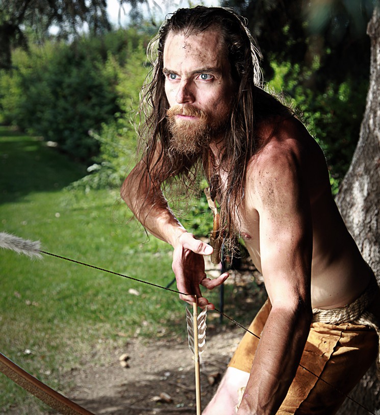
The picture of Doug in the upper right corner is a cutout of a picture he sent me. It just happened to be the perfect size, too. I spent about a half hour in Photoshop cutting a lot out by hand using the Pen Tool. He was on a complex background. Here’s the original photo:
I’m writing this at 10:30pm. I’ve finished quite a bit of the website. Here’s what I’m going to tackle tomorrow. If I get these pages finished, the website will pretty much be done. I only say, “pretty much” because Doug hasn’t seen it. Hopefully he likes it 🙂
Day 2: Chatting with Doug and Carrying On
Doug and I had a call this morning on the phone. The PHONE! I know, how primitive of us.
The good new is he likes the design of the site. Phew!
We tweaked some elements, but nothing major to report. I also set him up on Slack so we can share text and images and videos during the project and beyond.
Beefing Up The Homepage
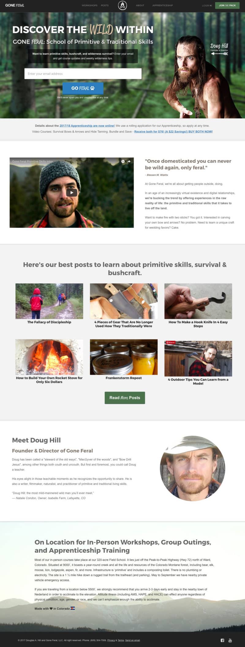
I made some design tweaks and added some more elements. Here’s the full homepage:
Formatting Blog Posts
Doug had about six finished blog posts on the SquareSpace site that I had to move over. I just did an export from SquareSpace and it imported nicely into WordPress.
These posts are going to be the key to our long-term marketing strategy for the membership site. It’s important that we make them look good and optimize them from the start.
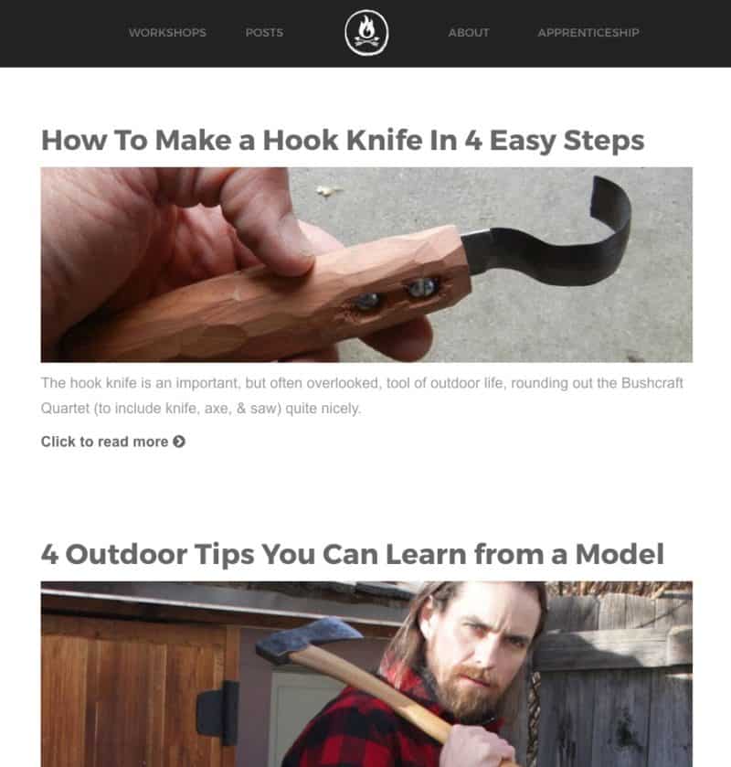
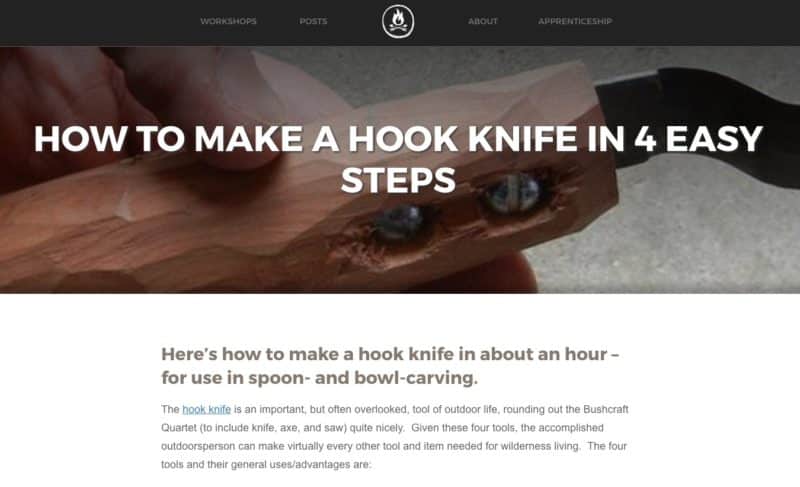
First, I designed where all the blog posts would live. We added a new link to the navigation bar called “Posts.” This directs to a page that will list all the latest blog posts to start. Eventually, as we create more posts, we’ll categorize them and design a better way to display them. For now, they’re just in a paginated list:
On the old site there was two pages called “Schedule” and “Groups.” We’re combining these into a page called “Workshops.”
It took us some time to design on the names of these navigation links. I like to really think about them in the long-term. I try to make them cover all types of future content.
We chose “Workshops” because this is where his in-person business content will live. To me, “workshop” tells you that it’s a live, in-person course.
We chose “Posts” because it’s better than “Blog” or “Articles.” “Posts” captures everything we want to do, plus it has an outdoor feel.
The About Page
I manually copy, pasted and formatted the content from the old site and stuck it on an “About” page on the new site. Originally, he had a page called “More Info” that was packed with information, including small blurbs about knives, axes, and clothing.
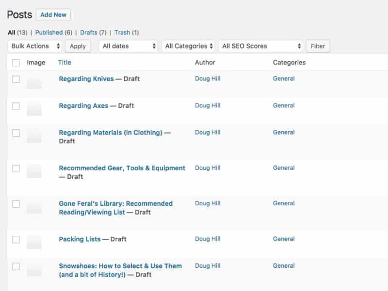
I took each blurb and moved it into a draft post in WordPress. Once he’s finished editing the videos for the platform, I’ll have him beef up those drafts to turn into full epic blog posts. They’re a good place to start with content marketing.
Redesigning The Single Post Page
For fun, I decided to take a page from SquareSpace and build in a cool post title area. It uses some overlays and parallax scrolling just like SquareSpace.
I’m surprised by how well this turned out and I’m quite happy with it. Usually shit like this drives me nuts, but this was pretty easy to make and format for every post.
What’s Next?
The only thing left to do is create the “Workshop” and “Apprenticeship” pages. These may be custom templates, but I won’t know until I start diving into the content and re-organize it.
What do you think so far?
Day 3: Finishing The Front-End Website
My goal today is to finish the website and all the content. It’s ambitious since I have to go food shopping and sit in line at the DMV to register my fucking Subaru.
But there’s not much left. The design stuff is basically finished. All I have to do is create a couple of pages and do some code cleanup. I’m pretty damn sure I can wrap this part of the project up by tonight.
Building a “Workshop” Custom Post Type
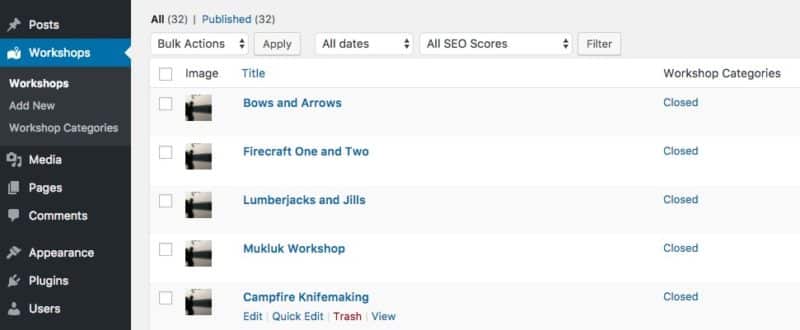
When I started fleshing out the “Workshops” page, I realized there was a lot of sub-categories I’d be working with. Doug runs a lot of in-person courses, workshops and group events. So I wanted to build him a custom post type where he could store all these and they won’t get mixed up with the membership content or the blog.
These “workshop” posts have their own categories. He can add as much content as he wants including a course register button. If he labels them as “closed” they won’t appear anywhere on the site.
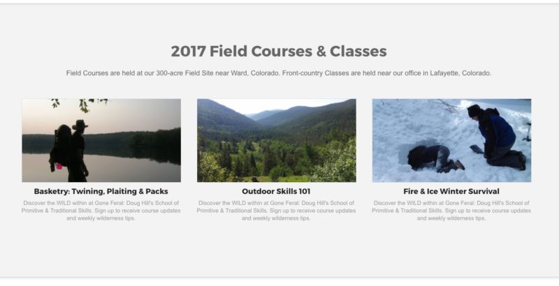
If he categorizes them as “field course” or “workshop,” they’ll appear in those areas of the “Workshops” page. Like this:
Organizing The Existing Content
What took the longest time today was organizing the content from SquareSpace and utilizing this new custom post type. I went through every single page (about 40 pages) and copy and pasted what was needed in each new post on WordPress.
Currently, there’s a lot of dummy copy and default images for some of the workshop pages. You’ll notice the first image in Field Courses is a picture of Doug near a lake. That box is filled with dummy copy.
What’s Next?
I feel as though I have the front-end website complete. Design-wise, it’s ready to go. Content-wise, it needs some work, but I’ll need Doug’s help.
The work that needs to be done is not important right now. What’s more important is getting the structure in place so we can spend the latter portion of this challenge messing with content.
The next step is building the membership side of the site. I will be starting that on Day 4.
Day 4: Building The Membership Site
Since I’m also in the middle of coding another membership site, a lot of this code was just copy and pasted over to this site. But I still spent a lot of time redesigning.
The first thing I did was add all the plugins I needed. Here’s what I’m using:
- Advanced Custom Fields – this is a new plugin I’ve never used before and it’s AMAZING! More on that later
- bbPRess – This is for the forum, or what we’re calling the Campfire.
- Featured Image Column – because I like seeing the featured image display in the list of posts in WordPress
- Lessons – a custom post type plugin I made for creating lessons and courses
- Posts Order – this allows us to organize the lessons within each course
- Remove Dashboard Access – this prevents users from seeing the WordPress dashboard
- Resources – a custom post type plugin I made for creating resources
- Restrict Content Pro – Set up a complete subscription system for your WordPress site and deliver premium content to your subscribers. Unlimited subscription packages, membership management, discount codes, registration / login forms, and more.
The Login Page
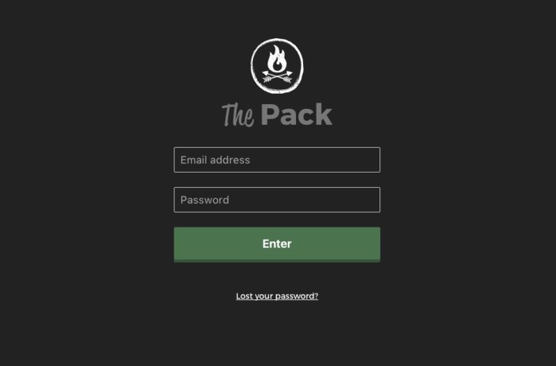
I love styling login pages. They’re simple, and I like to make them even simpler. Here’s what I designed for The Pack
Restrict Content Pro comes with its own login shortcode that you can add to any page. So I just styled that, and I also messed a bit with the template itself, which can you do.
I’m loving Restrict Content Pro because it’s really easy as a coder to make it look how you want without touching the core codebase.
The Membership Navigation
I created a new header file in the WordPress template called header-pack.php. This holds a new navigation bar that’s totally different from the front-end website.
I’m using the same header code, but I changed the way it looked.
A Single Lesson Page
Like designing new websites, I always start with the page people will spend the longest time on. For The Pack, that will be a lesson page.
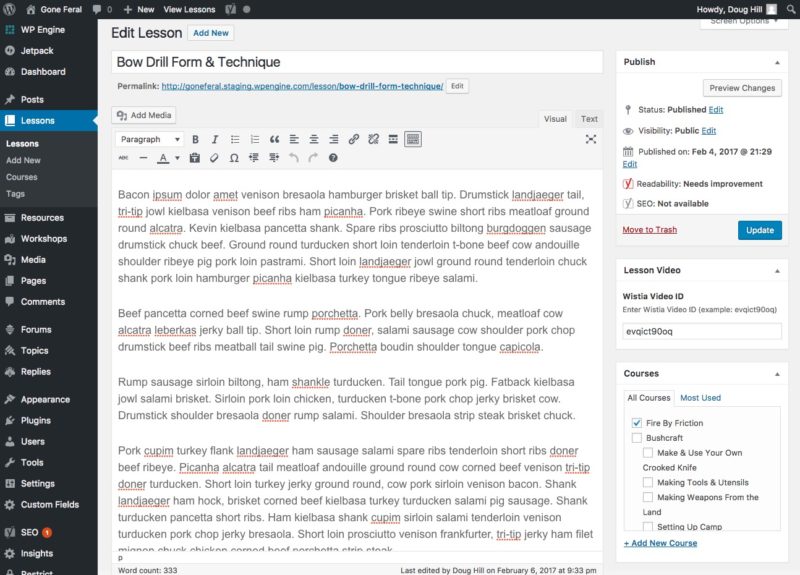
First, I’m using a custom post type in WordPress called Lessons (which is actually just a new kind of post in WordPress). Each lesson belongs to a “Course” (which is another name for category or taxonomy).
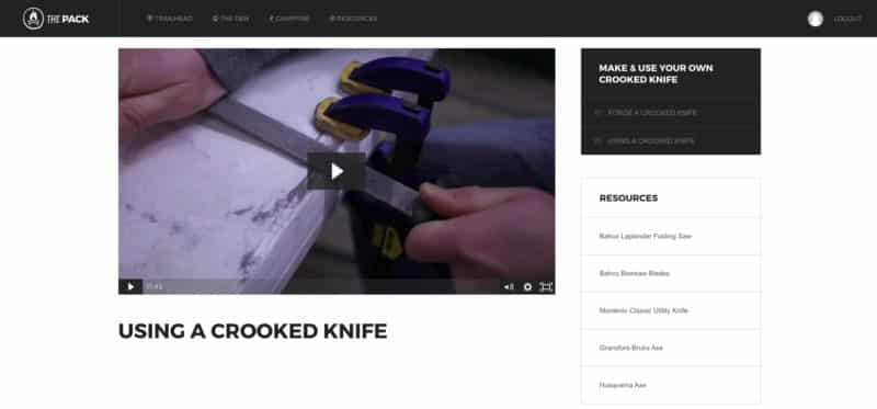
Now that I have a custom post type to work with, I can create a page template by naming it single-lesson.php. Inside that page, I display the lesson, which can include a video from Wistia. I used the Advanced Custom Fields plugin to create a meta box that allows me to add Wistia video codes so they display on the lesson responsively.
On the right column you’ll see a “Lesson Video” box where you can add a Wistia Video ID. I made that with the plugin, and you can make anything you want with it.
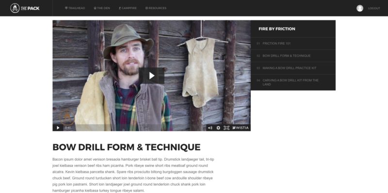
On the single-lesson.php page I just have some code that checks for a Wisita ID, and if one exists, it displays the video from that ID. Like this:
On the right side you’ll see it lists the Course title and all the lessons underneath. You can click them to skip through.
The Den
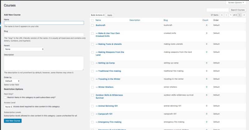
This is the area that will list all the courses, which are categorized by “Parent Courses.” All of the courses are really WordPress post categories that I’ve renamed. It’s a bit confusing to look at, but here’s a list of all the courses/categories that the lessons will appear under:
You’ll notice “Bushcraft” and “Outdoor Skills & Wilderness Survival” don’t have dashes next to them. That means their the Parent/Main categories/courses. All the ones with dashes are the actual Courses/subcategories
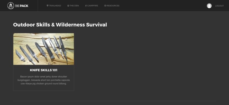
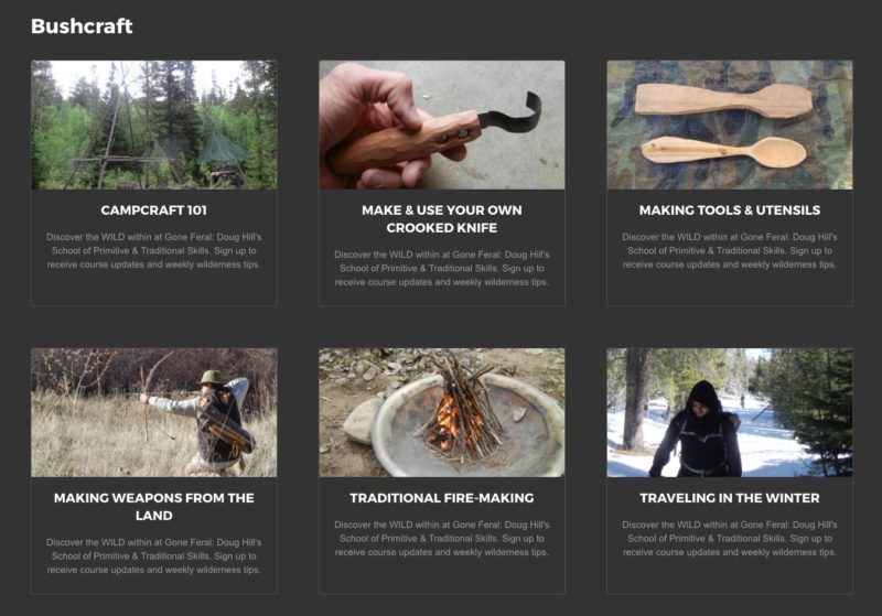
Here’s how they’ll be displayed in The Den:
There will be three in a row, but I only have one course created at the moment.
Day 5: The Superbowl
Doug stopped by my house to give me a flash drive of photos I can use to start adding to the empty courses I’ll create. He also borrowed my lighting gear for some more video work.
I got to show him what I have so far and how the courses and lessons will be structured.
However, I’m hosting a potluck tonight for the Superbowl and I have to make food and drink beer all day, so I won’t be working or making any updates.
I don’t give any shits about football, but I do like chili and beers!
Day 6: Finishing The Membership Site
I’m all finished with designing and coding for the time being. After this, I’ll be focused on adding lessons and resources so that Doug and I can start uploading videos.
The Resources Page
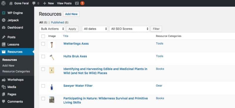
I created a custom post type that we can store “Resources” in. This is a page on the membership site that will have books, recommended gear, tools, and other useful information.
Each Resource is a blog post.
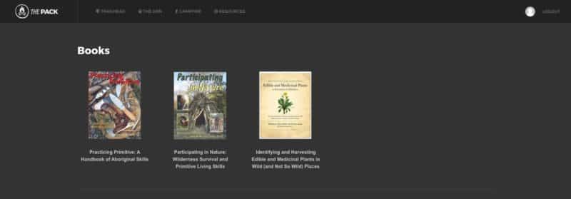
We display them similar to how we display Courses.
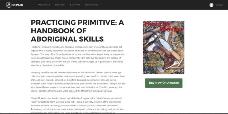
Each book you see listed is actually a full blog post. The idea is to have Doug write something for each Resource. He could also add videos and images if he wanted. But here’s what a single Resource looks like using single-resource.php:
You’ll notice there’s a “Buy Now On Amazon” button below the book. I’ve created another field using the Advanced Custom Fields plugin to add URLS and different button text.
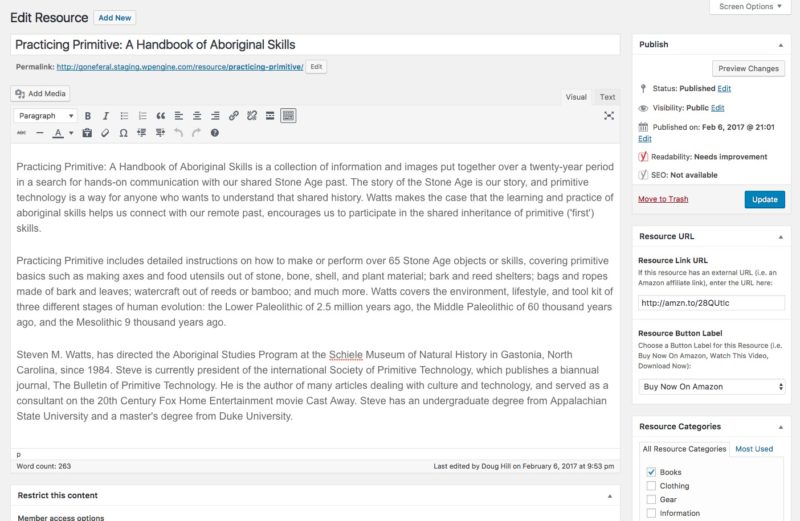
Here’s what that looks like in a Resource blog post:
You can see the box on the right side marked “Resource URL.” In that box you can add a URL and a button label from a dropdown. I’ve only added “Buy Now on Amazon” and “Download Now” but I’m sure more will be added.
The Campfire
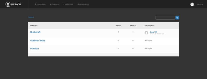
I’m using bbPress for the Forum and I just did some quick styling. Nothing fancy at the moment.
Once people start using it, I’m sure it will need some more attention, but for now we’ll see how this treats us.
The Trailhead
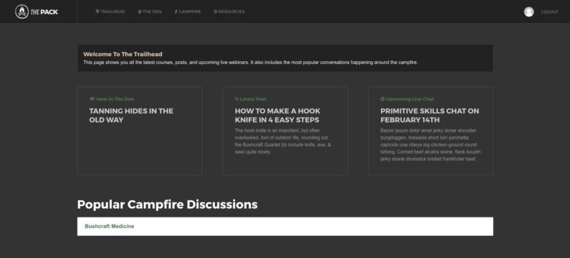
The last piece of the membership site is the dashboard area. This is where you’ll land every time to login, and it includes:
- An announcement box – which we control with a page in WordPress.
- The Latest Course – automatically pulls in the most recently added course information.
- The Latest Post – which lists the most recent blog post on the front-end site.
- Upcoming Live Chats – which is a page we control in WordPress.
- Popular Campfire Discussions – which automatically pulls in the topics with the most replies in the forum.
Once I start getting the Lessons and Resources added, I’ll film a video walkthrough of the entire site.
Day 7: Adding Lessons and Resources
I spent the entire day creating Lesson placeholders and resource posts. Doug has already figured out what the lessons will be and we organized them into courses and parent courses.
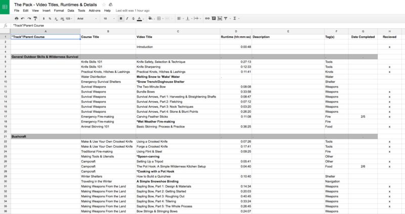
We’ve been using a Google Sheet to keep track of all the videos he’s producing and organizing them into course groups.
Adding Lessons
Since I know all the course and lesson information, I just create empty lessons in WordPress so I can start to visualize what it will look like on the site.
I added course featured images and dummy descriptions so I could show Doug when he came over today:
Right now, each lesson within these courses is totally blank. But Doug came over today and dropped off a bunch of videos on a flash drive that I will start uploading to our paid Wistia account tomorrow morning. That will start to flesh out the lessons, sans descriptive text.
Once I get all the videos up, Doug will have to go into each lesson and create some text. For now we just need something there, but in the future, the plan is to really flesh out each lesson with a lot of text and supplemental materials.
Adding Resources
Doug had a list on his current site of recommended books, videos, and gear. I took each one of those links and turn them into Resource posts, complete with a featured image and affiliate link.
Doing all this today took up a huge chunk of time. Tomorrow my plan is to upload a bunch of videos and add them to the lessons. We also have to start thinking about building some buzz.
Building Buzz and Price Talks
When Doug was over, we talked about getting the word out before we launch. The plan is to email his list three times.
Once on Thursday to hint we have something coming. Maybe something like, “The Netflix for Primitive Skills Learning.” Then another email on Saturday giving a full behind-the-scenes tour and what the pricing will be. Then a huge launch email on Tuesday.
We also talked a little more about what to charge. Initially we were thinking $19/mo for the two week beta program and $35/mo from there on out. But we’ve decided to bring down the price to an even $10/mo for the beta and $25/mo ongoing.
Day 8: Uploading Videos
Doug dropped off a flash drive with 39 videos on them. I spent the entire day uploading them one-by-one into Wistia. Doug has really slow internet at his place, so it was better for me to do them. Plus, as soon as their done uploading, I can add them to the site.
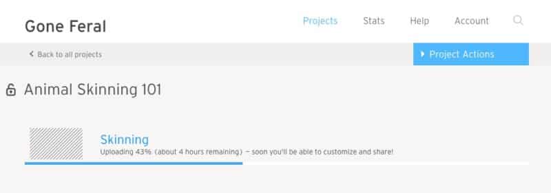
I created a new project for each course in Wisita for better organization. Some videos, like the Animal Skinning video above, is 36 minutes long. It’s taking a very long time to upload, but we have until the 13th to do it. So I’m not worried.
Getting Responsive
I took some time to code some of the pages so they’re responsive on mobile. Over time I’ll improve this, but for now things are looking pretty good.
Advanced Tagging
I thought it would be a good idea to add some cross-content tagging into each lesson and resource. I each custom post type for Lessons and Resources, I added Lesson Tags. That means the same tags are used for both Lessons and Resources.
This will allow Doug to automatically recommend Resources in each lesson. For instance, he can tag a Resource with “saw blade.” Then, if a lesson calls for a saw blade, he can add that same tag to the lesson. That will automatically pull links from Resources into each lesson, like so:
Pretty cool, right? Things will get complicated over time with tag organization, but it’ll be worth it.
The Registration Page
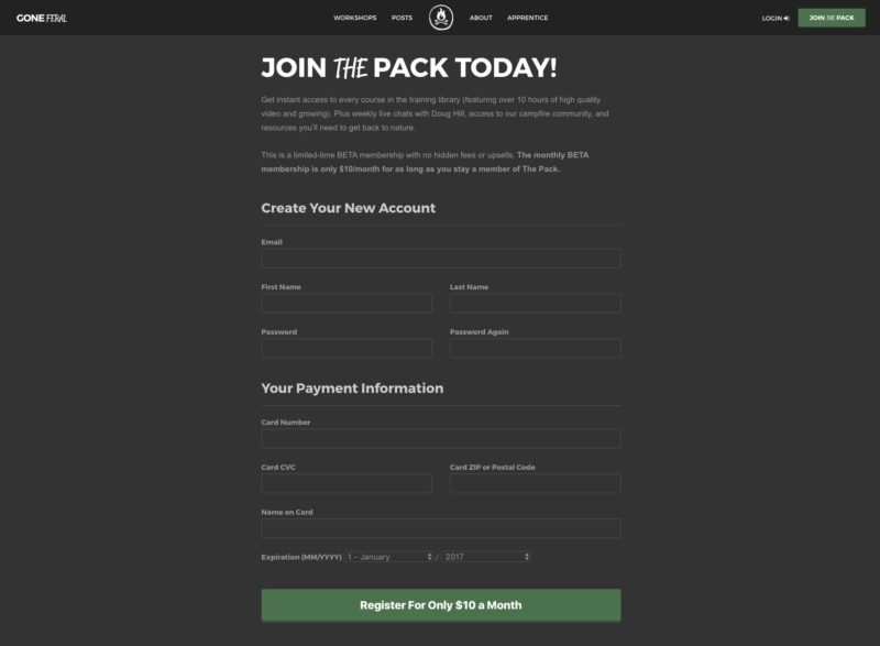
I was saving this for last, but I had some time to knock it out. I screwed around with the Restrict Content Pro templates and designed my own custom Registration page. This will be for BETA members when we launch.
I’ll be adding some security images and text there.
Day 9: Building the Sales Landing Page
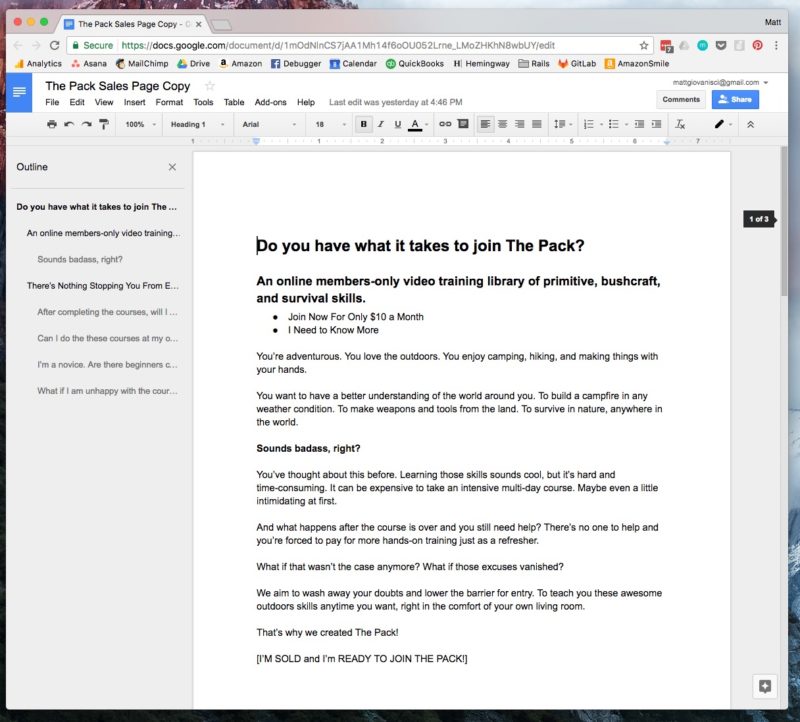
While I continue to upload the lesson videos, I was building the sales page. The first thing I did was write the copy in a Google Doc.
I have a three-act structure that I use for writing sales copy:
- Identify the problem.
- Imagine what it would be like if that problem was solved (The Benefits).
- How the product solves the problem (The Features).
1. The Problem
I started to think of the existing problem. I’m not the ideal customer for this product, but I tried to put myself in their shoes. What’s wrong withe the way things are done?
For me, it’s intimidation. Steph really helped me flesh this out. At first, I thought it was simply a lack of time and money. But the truth is, I think it would be badass to learn this stuff. But what’s stopping me from signing up for an in-person class with Doug?
2. What If… (The Benefits)
I didn’t have to go up into the mountains with a group of people I’ve never met before to learn how to build my own bow and arrow? What if I just wanted to learn simple things, like building a fire in any weather condition?
It would be fucking awesome if I could just pull up some videos and learn how to carve bow or any other primitive skill.
In a perfect world, I would never have to leave my house to learn this stuff.
That leads us to…
3. The Features
We built the Netflix for learning survival skills. Boom! It has this and that and it’s only $10 a month. Holy balls!
Now we’ve identified the problem, showed them the benefits of a better experience and than slammed them with the solution. Make sense to me.
I wrote out everything first and started coding it right into the page to make it look and flow well. Then I had Steph look at it to clean up the text.
Editing The Sales Copy
Steph is really good at identifying the emotion and what people really care about. Sometimes I can get overly technical and sell just the features. She looks at the benefits.
The first thing we tweaked was the headline. The original was:
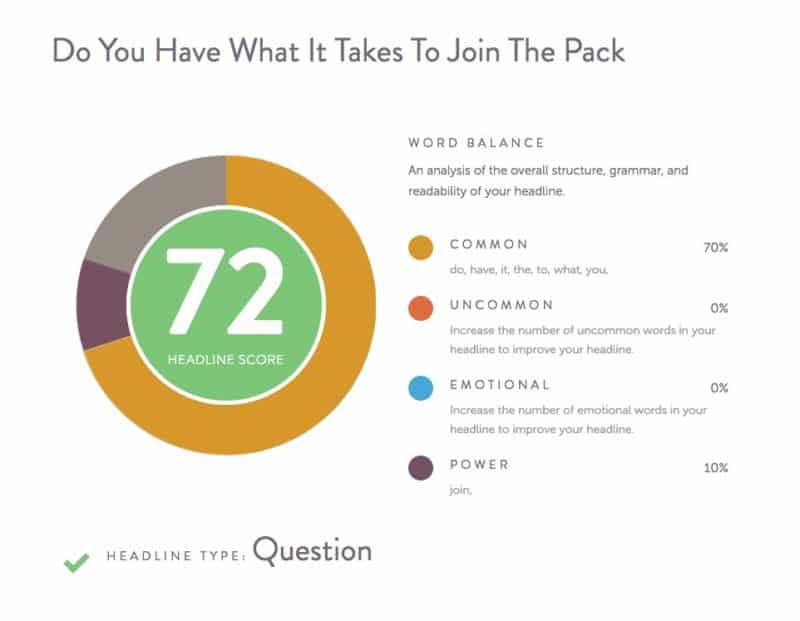
Do you have what it takes to join The Pack?
I had such a hard time coming up with a headline. I even used my favorite Headline Analyzer tool and scored pretty well with this.
Steph came up with something better. Even though Doug doesn’t like to use the term “survival” in what he teaches, it’s the word that people use. It’s like me with “niche site.” I fucking hate it, but if I want people to find me, I need to use it.
So we crafted a better headline:
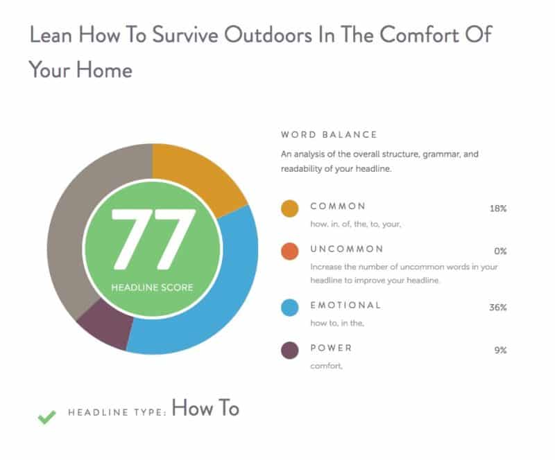
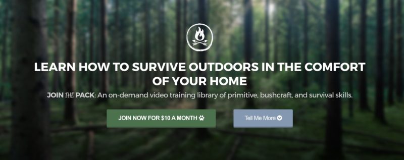
Learn How to Survive Outdoors In The Comfort of Your Home
BOOM!
A better score and a sentence with irony. I fucking love it!
Here’s how the beginning of the landing page looks:
I’m pretty happy with it so far. Once I get the page done, I’ll link to it.
Day 13: The Day Before Launch
On Day 11 we sent out an email to the existing Gone Feral email list in Mailchimp to announce the launch of THE PACK. We asked people to sign up for a different email list if they were interested in joining. Out of 590 subscribers only 15 joined the new list.
I quickly learned that a lot of people just don’t want to sign up for another list if they’re already on one. And 15 people is pretty decent with that fact. This is a list of people who had no idea this was coming. So I’m taking it positively.
What Happened Over The Weekend?
For the most part, I’ve been just uploading videos from Doug and cleaning up things here and there. I spent some time on Day 12 cleaning up the backend of WordPress and launching the live site.
I had to switch the domain (GoneFeral.org) from SquareSpace to WPEngine. It took some time because SquareSpace does things differently for people who don’t know a lot about website design. It’s good for them, bad for people like me.
Two-Week Marketing Blitz
Doug and I attend an in-person mastermind type thing once a month. It’s where we met. And we had one this Sunday.
Usually we present separately, but this month we did a joint ask. We were looking for ideas on how to market THE PACK for the first two weeks it’s live.
We got some really great ideas, but it all boiled down to a mostly long-term content marketing strategy. I was hoping for a really big, sexy idea, but I think slow and steady will win this race.
However, if you have any ideas, please share them in the comments. I’m open to anything!
Adding Text and Videos
Doug and I are working on finalizing all the video lessons and organizing the courses. He’s writing all the course, lesson, and resource descriptions in a Google Doc. I’ll be adding his text and Wistia videos I’ve uploaded to each lesson.
We’ll also be doing a lot of testing and combing over the site to make sure everything is working perfectly and ready to launch tomorrow.
Finishing The Sales & Registration Pages
Once THE PACK is ready to be viewed, I’ll be filming a video tour to add to our Registration Welcome page. I’ll be adding this video in this post so you can see everything.
Launch Day!
Doug and I were working on getting all the course and lessons descriptions written and added to WordPress until about 10pm. I also spent some time testing Stripe payments. The Restrict Content Pro plugin allows you to test payments in a sandbox mode, and Stripe lets you do tests, too.
I tested it with fake and real money. Everything worked! Phew.
Then I also created a video tour of THE PACK to use on the sales page. The very last thing we did last night was comb over the sales page to make sure all the copy was good to go.
The Final Recap
I’m burned out. I tackled way too many projects at once. I was also building another membership site, hiring writers for Brew Cabin, and general business stuff.
However, what I enjoyed about this challenge is doing the thing I’m good at: building WordPress sites. This was my first membership site and it was in a topic I know nothing about. My job was purely technical.
Doug did a excellent job working along side me. He said I created a monster within him. He was filming and editing videos like crazy for two weeks.
Sadly, we didn’t get a huge launch. So let’s talk about all that.
How Much Money Did We Make?
First, let’s talk about how much money we spent. This challenge had some overhead:
- WPEngine Hosting Setup (monthly): $29
- Restrict Content Pro Plugin (annually): $199
- Admin Columns Plugin (one-time): $59
- Wistia Video Hosting (monthly): $114
Total Money Spent to Produce This Product: $401
On-going monthly expenses: $143
Now let’s talk about how much money we made on launch day!
$30 for three memberships.
What I Learned From This Challenge?
We didn’t have a killer launch but we still launched something. We managed to create a massive product in just two weeks. Feels good 🙂
We didn’t have a money goal. It was a completion goal. It would have been nice to cover the first month’s expenses, but this is only day one.
We didn’t build buzz. We didn’t have a huge list, or even a big list to start with. We had 590 qualified subscribers, only two of which bought on day one. The other membership came from Money Lab.
We could have taken our time to build up a mailing list through content marketing on GoneFeral.org. But instead we made the product first. Now we can focus on building traffic, subscribers and revenue from this product.
I wanted Doug to feel like this was going to be a game changer. I wanted the launch to be decent so he would feel encouraged. It turns out he didn’t need that as much as I did. He was proud that we had built something. And now he has a reason to start putting more of his attention online.
I learned that this is a long-term game. As much as I wanted it to have short-term success, that was a pipe dream with the lack of people and buzz. I expected to build something and people would just buy. I don’t think it works that way. They have to have trust in the product. They have to know it’s valuable.
We still have plans to do that. So I will not consider this a failure. Instead, it’s a success like nothing else I’ve done!
We built a product that does not exist online, in an field that inherently doesn’t live online. And three people bought a membership. That means, people want it. People clearly dig it. Now we just need to attract more and our plan is to write articles, make videos, and get press.
I will continue to update as things progress.
Thank You
I have to thank Doug Hill, my friend, neighbor, and now business partner. Without him, this would not be a thing. All I did was build the site, but he filled it with what’s important. I have faith that he will take this thing to the next level. I will be there to help when I can.
Thanks to Stephanie Halligan, my amazing girlfriend for all the emotion support once again. She put up with a lot this time around. When I dive into projects like this, I go comatose. She understood, but I have a lot to make up for. She’s the best and continues to support me. I love her more than anyone in the world.
Finally, thanks to everyone who bought a membership and who WILL buy a membership in the future! You made this challenge a success, as minor as it was. Thank you for helping me prove that this is something some people want in their life.
And you can become a member right now 🙂
Peach out!
