This is the second ongoing “experiment” on Money Lab. Here’s the other one. For all you science nerds, I KNOW this is not how actual experiments are conducted. This is not a real lab either 😉
The Hypothesis
This experiment is to see if rebranding Roasty Coffee will result in more traffic, email subscribers, and revenue.
I started Roasty in March of 2015 as an experiment to see if I was capable to growing a website faster than I did with Swim University (which I started in 2006). It’s worked better than I thought it would.
The first month garnered only 451 visitors with about 15 articles and videos published. Since then, we’ve published one new article a week.
In a past Money Lab challenge to earn sponsorship money with Roasty, I said…
As of March 2016, the site gets 20,000 visitors a month. It has 736 Facebook likes, 1,032 Twitter followers, and 421 followers on Pinterest.
At that point we had a little over 60 articles published with about 600 email subscribers in Mailchimp.
The Current Health of Roasty Coffee
In the past seven months, traffic, subscribers, and revenue has exploded. In October 2016, RoastyCoffee.com…
- received 81,424 visitors.
- has 2,184 people subscribed to the weekly newsletter.
- has 101 articles published.
- was featured in an article on The Huffington Post.
- made $1,894.60 from Amazon Associates.
The Goal With Rebranding
In March 2017 (the two year anniversary of Roasty), I would like to double all the metrics mentioned. That means on April 1st 2017 Roasty needs:
- To receive over 162,848 visitors (we will count “Sessions” in Google Analytics)
- To have over 4,368 subscribers on the mailing list in Mailchimp
- And earn over $3,789.20 a month in Revenue (including Amazon Associates and other products or services we build)
This is a realistic goal that I think can be reached in the next 6 months.
The Roasty Rebranding Plan
I set up Roasty fast. I took what I was doing on Swim University and duplicated it. Now, I want to rethink about how people interact with this brand.
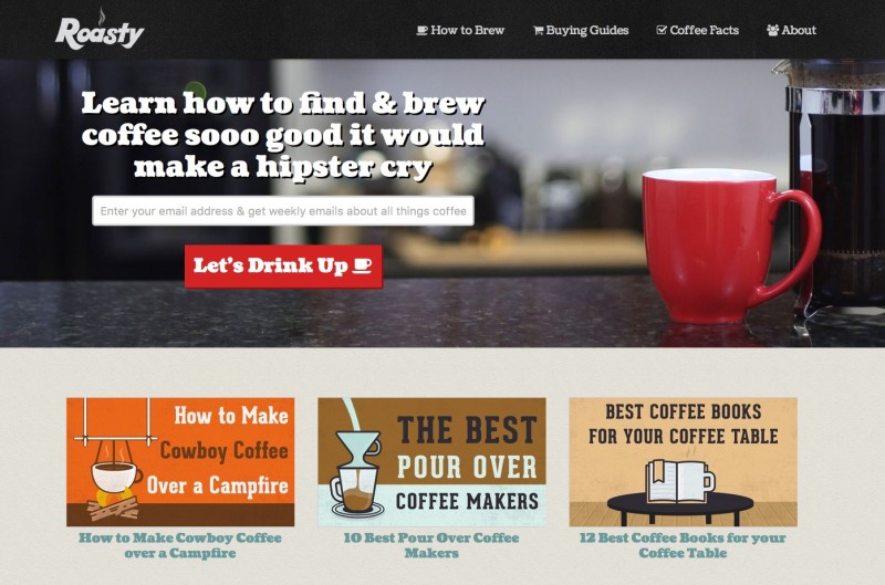
This is what RoastyCoffee.com looked like on March 21, 2016.
I’m also just tired of the look. I want something fresh and modern. So first and foremost, it’s an emotional decision.
Second, my girlfriend and I wanted to work on a project together. Something that would make us some extra money we could put towards of future dream home (a cabin in the mountains).
While we were on vacation (in a cabin in the mountains), we brainstormed a bunch of projects we could work on together. Finally I said, “why don’t we just work on Roasty together?”
The argument being, it’s already built, has traffic, and makes money. All we have to do is work together to improve it.
The New Mission
Right now, Roasty helps people appreciate great coffee without having to be a fucking hipster. That is still the mission, but we want to expand.
We want to include a lifestyle element, which includes, more storytelling, discovering cool products, and discussing the science.
We’re going to beef up old content by adding more stories, photos, products, and videos. To start, we want to redesign the site to be more modern and easy-to-read. And I ALWAYS start a new website we the logo design first.
The New Logo
This was a challenge. I wanted the logo to be different, but still be coffee-related. It’s easy to fall into the coffee logo trap that includes a hipster influence (Here’s what I mean) and a coffee cup with some steam lines.
I went with a coffee bean because it’s the most ubiquitous and easy to identify. But since the brand is Roasty, I added some FIRE!
See the coffee bean?
After designing it, it took some getting used to. I know it’s doesn’t SCREAM coffee company, and that’s EXACTLY what I wanted. It’s different, it’s modern, and it has grown on me!
The New Website Design
I haven’t started designing, but I have some ideas. I’m trying to find websites I love both for design and content. I’ve been inspired mostly by Alpine Modern for the past year – a local business here in Boulder, Colorado. I’m very drawn to the modern rustic look and Scandinavian design.
I want to focus all the design on reading. That’s exactly what I did on Money Lab. That means:
- No sidebar! Too distracting and no one clicks anything.
- Big, smooth fonts. Easy to read on any device.
- Less design, more functionality. If it doesn’t entertain or help the reader, it doesn’t get added.
- No navigation while you’re reading. Just like this site! It only appears when you scroll up. Makes sense, right?
- Search! We have 101 articles and they should all be easy to find.
- The Rabbit Hole effect! We want to customize what you should read next, not rely on some plugin with a basic algorithm.
The New Newsletter
One of the biggest reasons for the rebrand was my desire for a better email newsletter. Right now we have an RSS feed in Mailchimp to automatically deliver new articles.
Over the Roast email list has a 23.5% open rate, which is not terrible, but could be better. Here’s a recent screenshot of our “newsletter”:
We want people to LOVE getting an email from Roasty. We plan only send out two emails a month (instead of once a week) to start. But those emails will be packed with in-depth articles, awesome new products, and other coffee-related highlights.
The Rebrand Recap
Before I start putting pen to paper (text to screen), here’s a short list of all the changes that are going to happen in this rebranding of Roasty:
- New logo and website design.
- Newsletter redesign and content shift.
- Beefing up older articles and putting a hold on any new content for the time being.
- Improving the email subscriber conversion one page at a time.
- Creating better reasons to subscribe.
- Creating more products to earn more revenue (like video courses, guides, and sponsorships).
I’m sure there will be more to this rebranding effort, but for now, that’s what we’re focused on. The very next step for me is doing a total redesign on the website. That’s what to expect in the next update in this experiment 🙂
I’ve Finished The Website Redesign
This took a few days and a lot of thinking. I decided that the brand should continue to make good coffee accessible to everyone – not just the hipster elite.
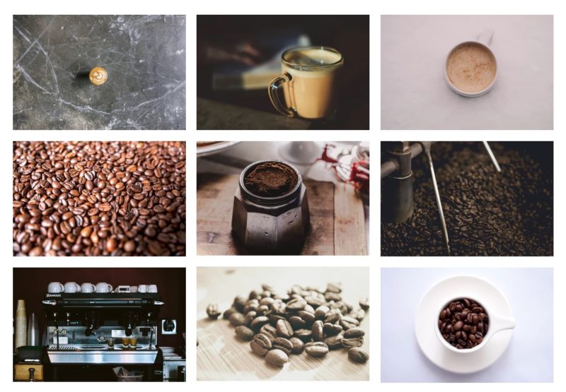
If you’ve ever been on a coffee website (highly likely because there’s a shit ton), you’ll notice photos like this:
This is a screenshot of coffee photos on Unsplash.com. These photos are free and EVERYONE uses them! I don’t want Roasty to feel like another hipster coffee brand. It’s the anti-hipster coffee brand.
The Initial Design Ideas
To be honest, when I started this project I wanted hipster coffee photos from Unsplash. However, I’m against stock photography. My plan was to hire a photographer or take them myself (which is not my strength).
But we have over 100 coffee-related vector images that my graphic designer made over the past two years. Changing from graphics to photos would mean a complete shift and unnecessary work.
When I started redesigning the site, I realized that those vector images matched the new logo and layout perfectly!
The Hidden Navigation Bar
The Navigation Bar is the most important part of a website. It acts as the main branding point. And over the years, I’ve been thinking a lot about what a navigation bar should do.
It started with Money Lab. I knew the navigation bar wouldn’t be important when someone is reading. So I took a cue from QZ.com and removed the bar from view while you’re reading (scrolling down).
But, when you scroll up (assuming you’re done reading), the navigation bar drops back into view. I love this little Javascript function because it allows the reader to focus on the words. This is especially important on mobile.
Here’s a video on the nav bar in action. You’ll also notice that the navigation is centered. This is the first time I designed a nav bar this way and I’m really digging it.
The Design of a Single Blog Post
Whenever I design a site on WordPress (like this one), I always start with what a post looks like. On a WordPress Theme, you only design a template (single.php file). This is what all posts will look like, and they’re the most visited posts on your site – not your homepage.
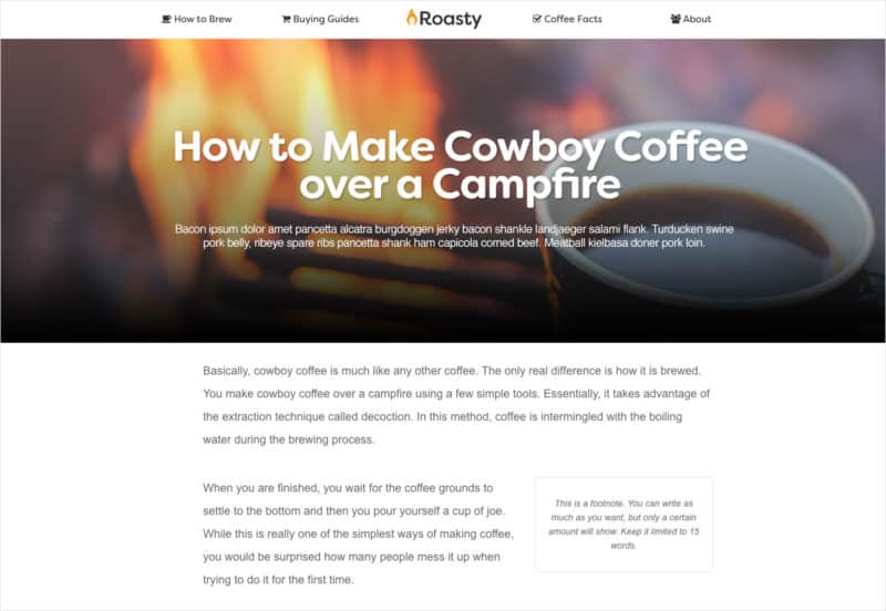
Again, my initial design idea was to incorporate more hipster photographs. So I designed the beginning of every blog post to look like this:
While I LOVE the way this looks, it doesn’t fit the brand. We’re back to being a bunch of hipster elites using stock photos with 123RF.com. Not the mention, EVERY WEBSITE ON THE INTERNET does this. Big ass photo, slight overlay, big headline, etc.
To be different, I completely opted out of this design. Mainly because every single post would have to look this way. That means getting over 100 images to match every post in this large size. That’s a lot of work and doesn’t improve the user experience.
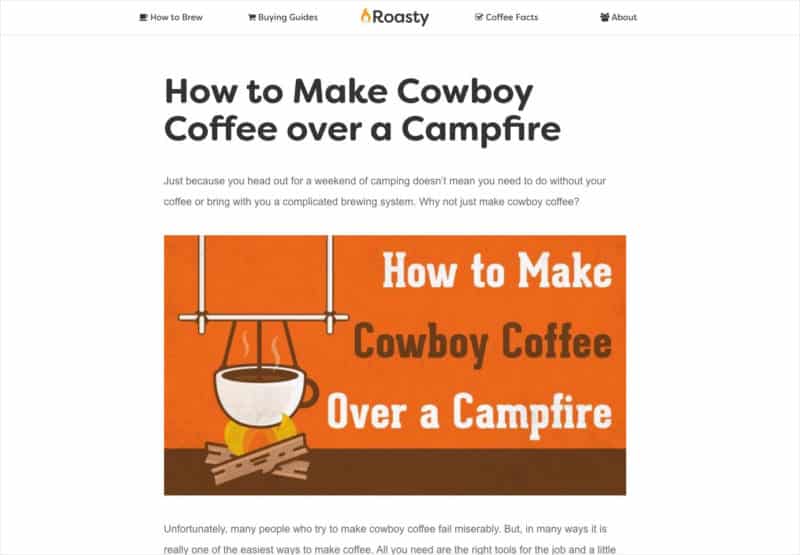
So, I’m keeping things simple and focusing more on the original vector artwork:
I know it’s not as sexy, but it will be easier to scale and keep Roasty different.
Focusing Hard on Mobile
The numbers don’t lie. Over the half of visitors to RoastyCoffee.com are on a mobile device (53.8% according to Google Analytics). And it’s going to grow.
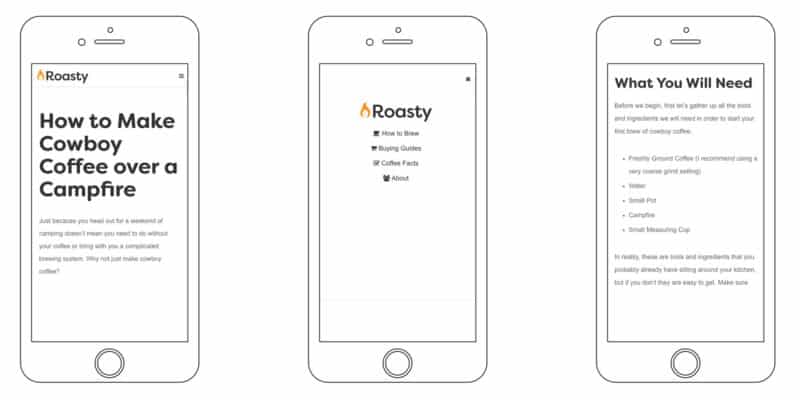
Right now, Roasty looks awesome on mobile. I redesigned the nav bar (with a little Javascript) and the rest of the post. Here’s some shots of what it looks like on a phone.
The nav bar is thin and when the little “hamburger” is clicked on the upper right hand corner, the second image full-screen navigation fades in.
The text is large and easy-to-read, and the navigation bar is hidden when you’re scrolling down. It’s simple and clean, and no design elements are sacrificed.
The Homepage
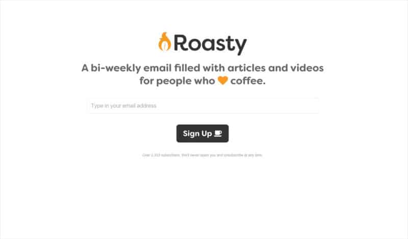
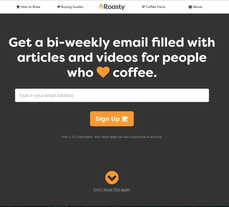
This is the single biggest redesign on the site. Because we’re focused on growing the email list, I decided to make the homepage dedicated to that mission.
Devotees may notice that Roasty is copying a lot of the design elements of Spruce Metrics. I’m in love with the Spruce design, and wanted Roasty to have a similar feel. The same goes for the homepage.
I wanted a single focus: subscribe!
I also took code from Spruce. When you enter your email address, you’re signed up for Roasty without ever leaving the page. I use the same AJAX script we used for the Founding Memberships on Spruce. And it’s connected right to the Mailchimp list using the Mailchimp 3.0 API.
I’m also using the API to pull in the total number of subscribers. I don’t know if this will help or hurt the brand, but it’s cool to see in real-time.
The Category Pages
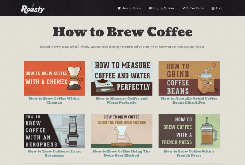
Almost nothing in the code changed on these pages. I still like the way the vector images look in the grid format. All of these category pages can be accessed from the navigation bar.
Here’s what the category pages currently look like on Roasty:
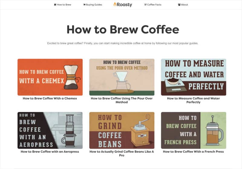
Now with a few CSS changes, here’s what this same page looks like in the new design template:
The major difference is rounded corners on the images to match the feel of the font.
The Website Redesign is Complete
Now the design is complete and I can move on to designing the email newsletter next. Once that’s done, I’ll be updating all the social media accounts, too.
Overnight, everyone will see a completely new RoastyCoffee.com. I plan to flip the switch on December 1st 2016 🙂
Launching The New Brand
I deployed the new code for the website and changed the branding on all the social media accounts.
What’s crazy is the amount of traffic the website is getting right now. Because of the holiday shopping season, traffic is way up! At the beginning of this week, we had a day with 4,500 unique visitors – a record-breaking day for Roasty.
We’ve also seen a huge bump in revenue. According to Amazon in the month of November we’ve made $3,442.33. A record-breaking month for Roasty. Compared to the measly $97.74 we made this time last year 🙂
There’s no perfect time to launch, but this was the worst time. It would have been better to wait until after the holidays, but what’s done is done.
The Launch Action Steps
The launch took two days. I pushed the code live yesterday and spent the entire day today cleaning up bugs. There was some problems with how to site was responding on mobile.
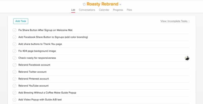
I created a quick project in Asana for a checklist of things to do.
Then, I started banging out all the tasks. This is a world I’m very familiar with so there was very little stress for me.
Here’s EXACTLY what I did in order:
- Re-coded the site on a staging server provided by WPEngine (a huge bonus for hosting with them).
- Double checked the code, had Stephanie and Jason Zook give it a quick once-over.
- Deployed the code and tested everything again.
- The homepage signup box wasn’t working (which sucked because I was getting a lot of traffic to the homepage from LifeHacker at the time). Live chatted with WPEngine. They found and fixed the problem (another huge bonus hosting with them).
- Made a list in Asana of all the bugs I caught, especially on mobile.
- Knocked off all the tasks in order. All code stuff was done on the staging sever, then deployed when they were all finished.
All in all, it was pretty easy and I’m happy with the results. No downtime at all.
Focusing On Getting Subscribers
Traffic and revenue are good right now. The real issue is getting subscribers. The site has always sucked at that.
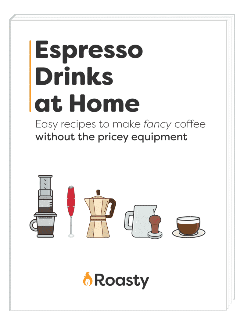
Stephanie and I (but mainly Steph) worked on creating a digital guide that we could use as a opt-in bribe on our most popular post: How to Make Espresso Without An Espresso Machine.
I helped create the outline, guide template and cover art. And Stephanie put the whole thing together. She wrote all the words, organized all the graphics and it came out fantastic!
So now we have three digital guides to give away in exchange for email addresses. We also have an 8-minute coffee brewing video. The other two guides are pretty weak, but still have some good info. They will need to be improved and rebranded very soon.
Setting Up List Builder 3
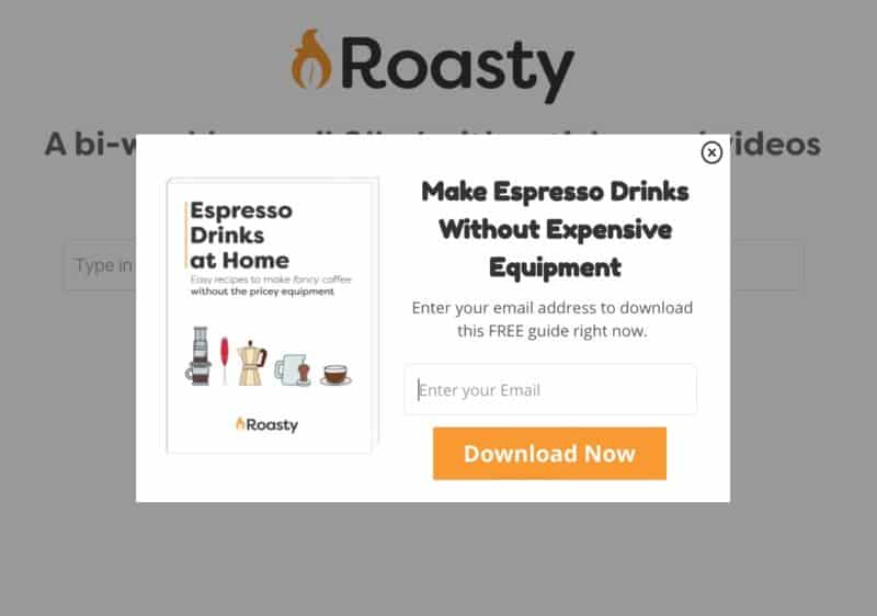
I’m paying for SumoMe to run my social media buttons and popups. Normally, this is something I would code myself, but setting up List Builder is just easier for now.
It’s only been a day, but so far the performance is pretty weak. I honestly thought I could achieve above a 1% conversion. I will have to continue to test the popup to improve.
List Builder 3 is fairly new and I love how you can full customize the pop-ups. It really matches the brand right now, which I like.
This is just the first popup on a handful of pages. I will be adding the other ones this week and make another update when I have more data to share.
Last Minute Welcome Matt
Yes, I call it a Welcome Matt. Deal with it!
I coded a simple static welcome mat for Jason on his site JasonDoesStuff.com. So at the last minute, I decided to use that same code on Roasty to see what happens.
I mixed the Welcome Matt code with the subscribe AJAX code I used on the homepage and came up with this:
The visitor sees an AJAXed subscriber box (meaning you can subscribe and not leave the page to confirm). Once they enter their email address and subscribe, form magically disappears and displays share buttons.
Then, the next time to visit a page on Roasty, you won’t see the Welcome Matt (unless you delete all your browser cookies).
Rebranding the Social Media Accounts
This was VERY easy. I had an idea in my head about using a bunch of previously made vector graphics in a row. These are all illustrated coffee making products with the tagline.
I doubt this will improve anything with the overall brand, but we’ll see. Here’s some screenshots of all the social accounts:
I’m going to continue to focus on getting subscribers and increasing my traffic to subscriber conversion rate. My goal is to get it above 1%. That would net us 900 new emails a month.
On top of that, I’ll be improving the speed of the site.
Improving Email Subscribers
For the past few days I’ve been focused on growing the email list. I’ve been redesigning some popups, tweaking the Welcome Matt, and creating embeds (more on those in a second).
I’m writing this on December 3rd 2016, just 3 days into the new rebranding. On December 2nd, we were able to capture 34 email addresses with 3,400 visitors. I hit my target of 1% conversion. But I think we can do better. This is just the start.
Keeping Track of Email Forms
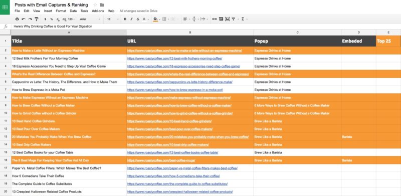
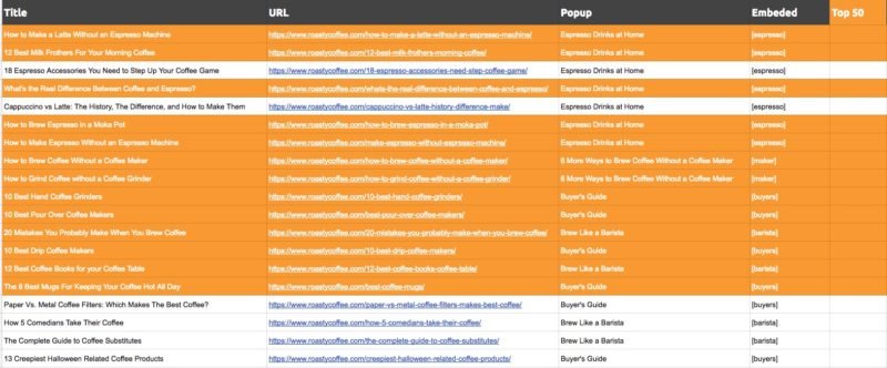
One important thing I did was create a spreadsheet of every post on the site. This may seem redundant, but it will help me keep track of what opt-in forms are on which posts. Here’s what it looks like in Google Sheets:
All of the posts highlighted in orange are in the top 25 most visited posts according to Google Analytics for 2016. These will change over time, so this is just a snapshot.
One column shows the name of the popup that appears on that page. Here are the popups I have in SumoMe right now:
The conversion rates are not great. But it’s better than 0% conversion which is was before. I plan to add more popups to more posts as we create more free guides and things to give away in exchange for email addresses.
My goal is to be collecting at least 1,000 emails a month, which should not be an issue considering the site is getting close to 100,000 visitors a month (today it’s a little over 96,000).
The New Embeds
Steph brought up a good point. Rarely when she visits a website does she subscribe based on a popup in her face. She and I are in the world on internet marketing, and can’t stand popups.
So to combat that, I created shortcodes that embed email forms right into the post. These are forms we’ll be adding manually from here on out and they work just like the Welcome Matt. Here’s what one looks like:
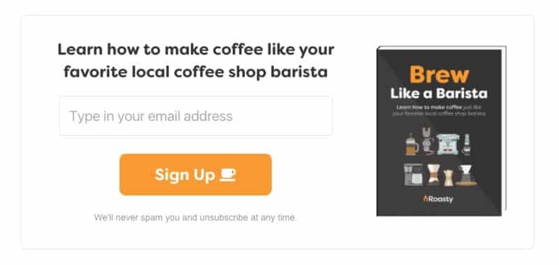
This is just an image 🙂
When you enter your email address, you don’t leave the page. It flips to a few share buttons and then these embeds will disappear from the entire site, including the Welcome Matt. We already have your email address so there’s no sense in showing you these. We add a cookie to your browser called “roasty_subscriber” and that’s how we know you don’t need to see these.
Any Additional Rebranding Affects?
As of now, the rebranding has been smooth, but not much has changed in the way of traffic. Our email subscribers have increased, but that’s because of this extra focus, not the rebranding itself.
It’s also hard to tell if the rebrand had any affect on revenue. My hunch is it hasn’t. But it’s something that’s going to take time to discover.
Overall, I’m happy with the way the site looks and functions. I’ll continue to work on growing the email list and making the site faster.
Fixing the SSL Problem
Today I noticed our SSL wasn’t working on most of our posts. We have an SSL certificate for the domain, which means our site uses HTTPS instead of HTTP. This is good for SEO but more important for people buying things. Even though we don’t sell anything yet, it’s good to have.
But some pages weren’t displaying the little green lock icon.
This was because the images from my Amazon plugin weren’t using the HTTPS Amazon provides. So I fixed that and made sure all my embedded images were using the proper HTTPS, and that corrected everything.
Now the site is 100% secure and should help SEO quite a bit. Not sure how much though, but anything helps.
Unexpected Sponsors
Roasty got its very first paying sponsor, and it had nothing to do with the rebrand.
They reached out by responding to an automatic email sent out by Mailchimp. Meaning, they’re a subscriber and asked to advertise with us in December.
I’m keeping the details quiet until the campaign is over, but for a small price they’re sponsoring two email blasts in December with a giveaway.
We’ve redesigned the emails to be more like a newsletter that holds several links instead of just one like it was before. So I’ll keep you updated on what happens 🙂
The Editorial Calendar for 2017
Since the launch of the rebrand, I’ve been happy with the direction of Roasty. I’ve gotten great feedback on the new design and have a good grasp on the future of the brand.
I’m writing this just 5 days after the rebrand and I want to share some stats. Since December 1st, RoastyCoffee.com has earned 136 new email subscribers. That’s a 0.79% conversion rate which is already better than November’s measly 0.29%. In November alone, Roasty earned 273 subscribers. It looks like we’re going to destroy that number!

Wow! Already halfway to through the penis and it’s only December 5th!
Also, Roasty has already earned $837.62 from Amazon. That’s in just FOUR days (December 1st to December 4th)!
I don’t believe the revenue increase is because of the rebrand. However, the increase in subscribers is DEFINITELY because of the rebrand’s focus on growing the email list.
The Newsletter and Contest Brought to You By Espresso Unplugged
Roasty earned its first official sponsor: Espresso Unplugged. They reached out via email asking to advertise with us. The deal was smooth all the way through.
They are sponsoring two emails we’re sending this month and running a contest.
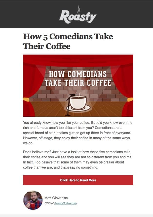
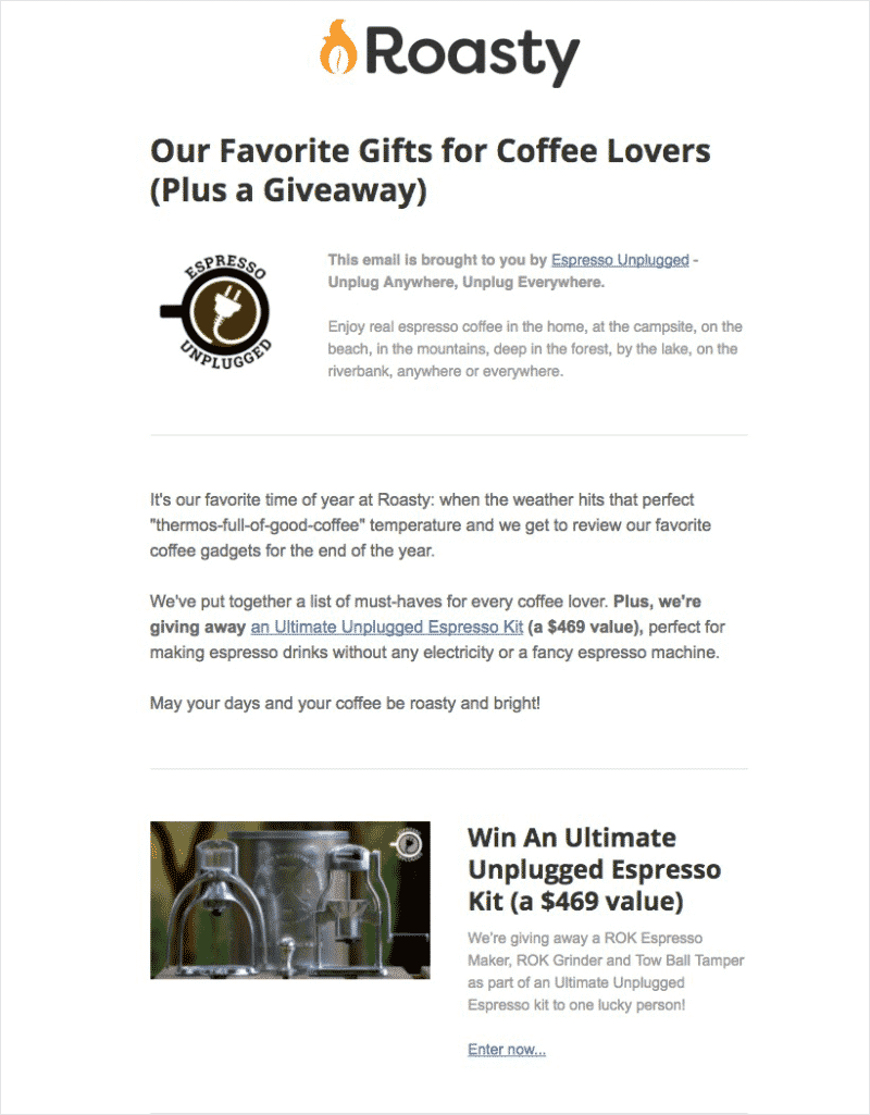
The first email went out today with the new branding and layout. Here’s what it looked like in case you’re not subscribed (and you should be if you love coffee):
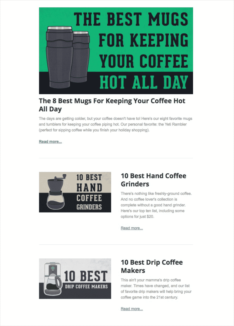
This is just the top half of the email. There’s even more content below:
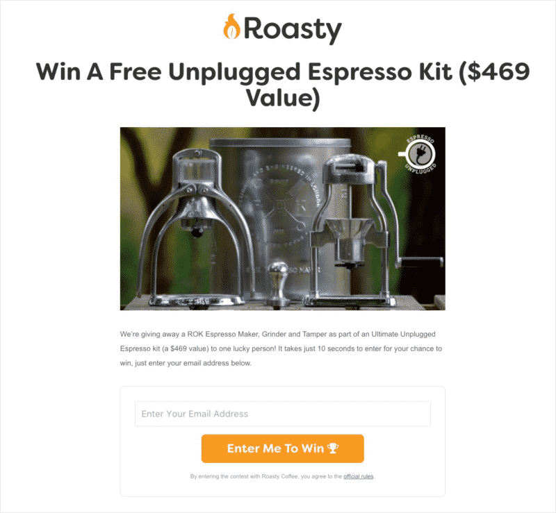
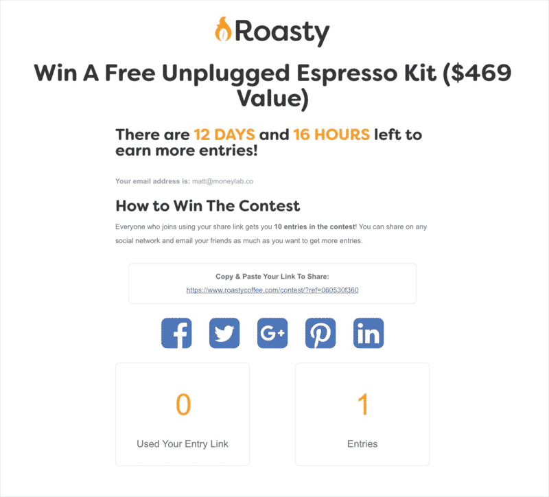
The contest is running smoothly, too. I had built a contest page a few years ago on Roasty and spent the weekend updating the look to match the new branding. I also added all the new copy from the contest.
Here’s peek of the new contest page:
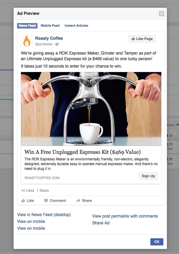
In order to promote this contest and gain email subscribers, I’m also running Facebook ads. I set up a retargeting campaign to send people to this page.
I installed the Facebook Pixel on Roasty back in 2015, so I have the data. And that makes it super cheap to send people to the contest page.
I created 5 different ads:
First, I created a single Campaign called “Roasty Contests.” This will hold all future contests we run.
In that Campaign, there’s an Ad Set called “December 2016” (since we’ll only run one contest a month, this will be a unique identifier).
In that Ad Set, I started with a single ad, and created four more with different images. The winner seems to be this one:
Right now, I’m spending $25 a day. At the end of the campaign, that will be $350 total, which is less than I made from the sponsorship deal. It’s worth it for those email addresses in my mind.
I could also explain how the contest itself works, but that would take a while.
Ok, fuck it, we’ve got time!
How The Roasty Contest Works
It’s crude, but it works.
The visitor lands on the page and enters their email address. I’m using a simple Mailchimp form that forces them to confirm their address (no bots here).
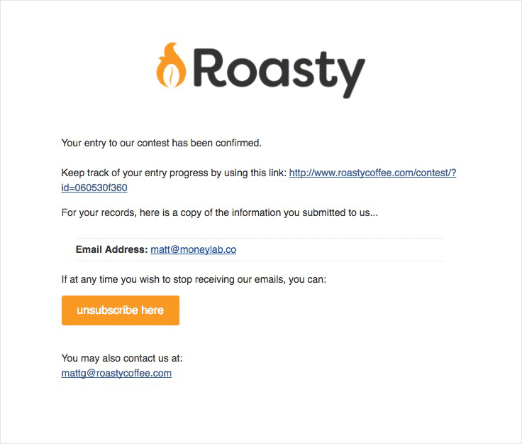
Once they’re confirmed, Mailchimp sends them an email that looks like this:
That link you see is a special link I designed using Mailchimp’s merge tags. I’m just using the Unique ID that Mailchimp gives each new email address. This single, random string of numbers and letters runs the entire contest.
The contest page is just one big IF statement. IF an “ID” exists in the URL, then show this content on the contest page:
What’s important here is the Share Link. It’s different from the one you get when you confirm. This is the link you share out to get people to enter the contest. For every person that enters the contest using your share link, you’ll earn 10 entries.
All of this is possible using the Mailchimp API. And here’s where it gets crude…
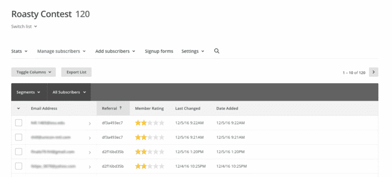
These emails go to a separate list in Mailchimp I’m calling “Roasty Contest.” That way I can add a new List Field called “Referral.”
Those random strings of numbers and letters in that field are the Unique ID from the people that referred them. Yes, it’s confusing and it makes the drawing process manual.
At the end of the contest, I export this list and award entries based on these referrals. So I usually end up with a massive spreadsheet with all the entires. Then, I use Random.org to pick.
I realize there are MANY contest apps out there I could use, but this allows me to control the look and feel of the entire contest process.
Let’s Finally Talk About the 2017 Editorial Calendar
I’ve been up in the air about how to deal with creating new articles on Roasty in 2017. Part of me wants to continue to publish new articles each week, and another part of me just wants to focus on improving the articles we have.
In a perfect world, I would do both. I would continue to publish new articles AND improve old ones. But this isn’t a perfect world and I have a tight budget.
Right now the risk-tolerant experimental side of me is winning. What if no new articles were published in 2017, and we solely focused on improving existing ones? Would traffic continue to go up?
Who knows? But I’m willing to bet on it.
A Little Bit of Fun
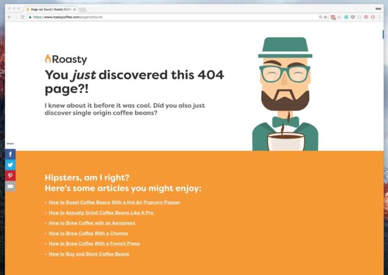
Oh, I completely forgot to add this, but I created a fun little 404 page 🙂
Roasty Is Kicking Some Serious Ass!
Traffic is at an all time high. So far in December (15 days after the rebrand) we’ve gotten 59,189 sessions according to Google Analytics. That’s 12.43% higher than the previous period.
Now, this is partly due to the holidays. Traffic is up because people are finding our buying guide posts, but I don’t expect a big drop after the holidays.
All that traffic is boosting our revenue from Amazon, too. So far in December we’ve made $4,092.42, which already crushed November’s total income of $3,442.33 (and we’re only halfway through the month :-)).
The Focus on Subscribers Has Paid Off
Steph and I (but mostly Steph) created two new guides for people to download in exchange for an email address.
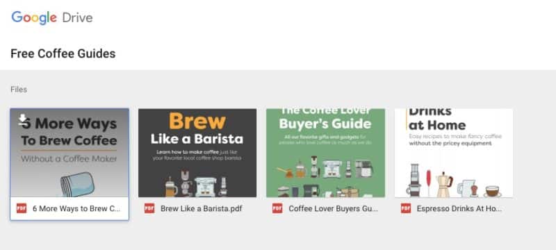
When someone subscribes, they are sent an email with a button to download all the guides. I host them on a shared Google Drive folder.
We added popups, embeds, and Welcome Matts to every page (the Welcome Matts are automatically added to every post via the template). We’re keeping tracking of each page using a Google Sheet:
The spreadsheet is completely filled out. And again, the rows highlighted in orange is our top 50 posts on the site.
It took me a long time to add all these popups and embed codes to the posts. I was being lazy and traveling back home for the holidays. But I’m finished now.
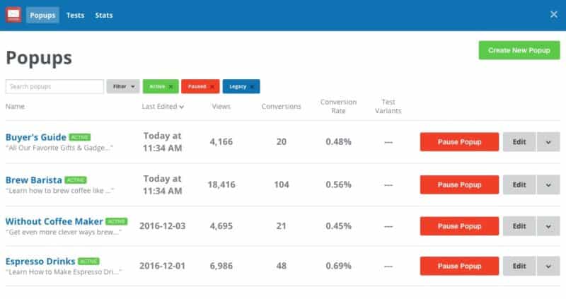
SumoMe Popups on Roasty
And because of this work, we’re gaining mad subscribers this month. Check out our Spruce Subscriber Dashboard:
Already in December we have 478 subscribers. The month before we earned 197 subscribers TOTAL. I’m hoping to earn over 1,000 subscribers this month and continue with that trend. That’s a 0.8% email/traffic conversion, and to be honest, that sucks.
Our site attracts so many different kinds of coffee drinkers, it’s hard to pinpoint what will get them to subscribe. However, this is a much better conversion rate than we had before.
I’m going to work to improve that number. I need to test different embed codes and popups and Welcome Matts throughout the year to see what works best.
More About the 2017 Editorial Calendar and Wrapping Up
This experiment so far has been fun and successful. The actual rebranding of the site has really not improved anything. But the act of rebranding has focused us on improving the email/traffic conversion and revenue.
The Editorial Calendar
In 2017 we will NOT publish any new posts unless they’re sponsored. Instead, we’re going to work all year to improve the existing 105 posts on the site.
This is an experiment to see if we can increase our traffic via search by optimizing what we already have. I think we’ll continue to publish new posts, but we’re gonna try this for a while and see what happens.
Subscribers and Newsletters
For now we will send out a bi-weekly newsletter that will be curated by Steph and I twice a month. We may increase this to weekly if things really start to pick up. It’ll be themed and include links to articles on our site and others.
Each month we’ll host a giveaway. This will help increase subscribers. We already have two months booked with contests from coffee companies reaching out to work with us :-). One of them is running right now and we’ve earned 815 contestants so far.
We’ll also continue creating specific, downloadable guides (PDFs and Videos) to increase our subscriber numbers per post.
Revenue Goals and a Surprise Product Announcement!
We plan to work with more sponsors this year now that we have some traction. And we’ll continue to earn income from Amazon by adding more (and better) links to older posts.
Now for the surprise 🙂
For the past six months I’ve been stashing the Roasty profits in an Ally savings account. This is the money that Roasty has made after all expenses, including contractors (articles and graphics), hosting (WPEngine), email marketing (Mailchimp), advertising (Facebook), etc.
I saved $4,056.98 in an account I called “The Roasty Product Fund.”
The idea here was to use this money to make a product to sell on Roasty. That product is going to be a video course on how to brew coffee at home like a barista.
I’m going to film new videos on how to use every single type of coffee maker out there, including an espresso machine.
Most of the money was for our “set.” I rented a large house with a stunning kitchen in Breckenridge, CO.
The rest of the money was used to fly my friend and videographer out to help me film it. I also used some money to rent an SUV to drive all my coffee equipment up the location – and the camera and lighting equipment.
We start shooting on January 22nd 2017 and we have five days to get all the footage. Then, I’ll work to do all the editing and creating the product.
I may turn this project into a Money Lab Challenge. If you’d like me to document this project, tell me in the comments or write me an email.

