This challenge is different from my last 4 challenges. I have a long timeline and it’s already scaring the shit out of me! You’ll soon know why.
The Challenge
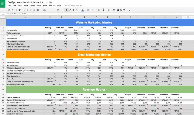
I keep track of my business growth with a few Google Sheets. At the end of every month, I manually enter the following data:
- Total Monthly Visitors to my website (via Google Analytics)
- New email subscribers and unsubscribes (via MailChimp)
- Revenue earned and number of products sold (via Amazon Associates and Gumroad)
These spreadsheets are simple, but help me make decisions in each of my businesses.
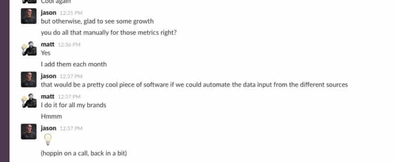
I send a link to the GetSponsorships.co spreadsheet to Jason Zook at the beginning of every month via Slack. He loves it because he gets to see an overview of our business, without doing the work to generate the report.
The metrics are easy-to-understand, and that’s what makes what Jason said next so appealing:
Jason: that would be a pretty cool piece of software if we could automate the data input from the different sources.
Naming The Yet-To-Be-Built Web App
We started brainstorming app names over Skype. The first one we landed on was Reflex. But after researching the name, it made us nervous. There were a lot of apps already with a similar name.
On another call, I talked about my monthly business ritual:
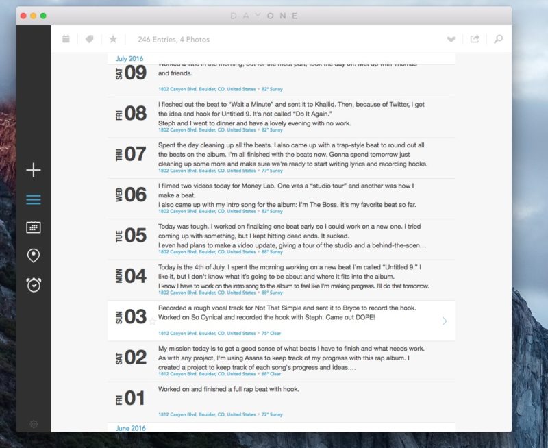
At the beginning of every month I update the “Monthly Metrics” spreadsheets across my businesses (SwimU, Roasty, and GetSponsorships). Then, I scan my daily business journal (Day One App) and write down the important events.
I also go through my completed Asana tasks and write down major tasks that were finished.
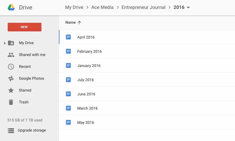
I take these notes and store them in a Google Drive folder called “Entrepreneur Journal.” The folder has Google Docs for each month.
Now here’s the important part…
In these Google Docs, I list out all the “Tasks Accomplished“ for the month in each business. After that, I use something called “Rose, Bud, Thorn.” Under Rose, I list the things that went well that month. Thorns are for the things that didn’t go well, and Bud is what to focus on the next month.
Jason liked this concept and it shifted our app to focus more on education than metrics.
We started thinking in the plant/tree arena and came up with the name Spruce, or Spruce Metrics. We liked it because of the double meaning: the tree, and as in “spruce up your website.”
The Minimum Viable Product
We want the app to do the work of the original spreadsheet without adding the data manually (like Jason’s original idea on Slack). It could also be a place to keep a business journal and provide education based on your metrics.
The temporary tagline is: Simple Analytics To Help You Grow Your Business. It’s the metrics app for people who hate metrics! We want the app to look great and easy-to-understand at first glance.
To take some work off my plate, we worked with a graphic designer to help us come up with a logo. Here are some of the concepts so far:

Steph pointed out that Spruces don’t have leaves. Hence the pinecone logo, too.
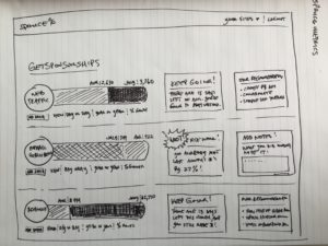
I asked Jason to wireframe what he thought the app could look like. We wanted the metrics to make sense at first sight, so he drew up some concepts:
What We’re Starting With
We have the idea and we have the name, but I had to learn how to code first.
I’ve been learning HTML, CSS, and PHP for the last 15 years to build websites. In 2007, I created my first web app. It was a sales lead management tool that I built for the salesmen at the pool company I was working for using procedural PHP. It was primitive.
In 2009 I built a social media network for dogs that never launched. It was called DogBarkz (a name I came up with and regret).
https://www.youtube.com/watch?v=78pcpyAooVo
In 2012 I helped start a company called Simp (a name I came up with and regret) and started building project management software for contractors. I was the front-end developer and got pushed out by the back-end developer – he blamed me for his code not working.
It was a nightmare and never launched. It was also one of the worst times in my life, but we don’t have time for that story 🙂
The day after I launched the rap album, I started learning Ruby on Rails using Lynda.com.
I have prior experience coding web apps in procedural and object-oriented php (because of WordPress and the nightmare story I just mentioned), but Ruby was a whole new world. And Ruby on Rails is great, but I had to learn how to use Terminal. YIKES!
Here’s What I Built So Far
After about a week of learning and trying to understand all this new stuff, I finally got the hang of it. I had to learn:
- Ruby – The programming language (like PHP, Python, Javascript, etc.).
- Ruby on Rails – A framework created by David Heinemeier Hansson from his work on the project management tool Basecamp (formerly 37 Signals).
- Git – Version control software.
- GitHub – Web-based Git repository hosting service.
- Heroku – Free
web hosting to quickly deploy apps for testing on the Internet.
Most developers are probably familiar with these, but they’re new to me. It took a lot of reading, watching video tutorials, and failing thousands of times. I thought about quitting every fucking day. Still do.
This is the reason the challenge is scaring the shit out of me! I feel like I’m in over my head. My other challenges were based on skills I already knew, like video, audio, and website design.
That said, I’m having fun! It’s solving mini puzzles, like Myst. Remember that game?!
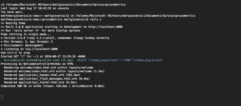
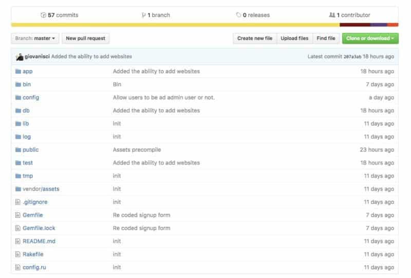
I got my local server up and running, and I’m doing all the development work on my iMac and my MacBook Air. I’m using GitHub to store the code to work between computers and with future developers.
I also set up Heroku so I can deploy the app to the Internet to show it to Jason (and the world).
Here’s what the app can do so far:
- You can create an account
- Login and Logout
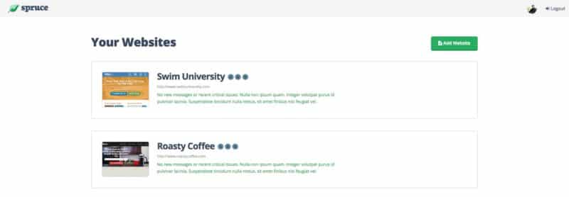
- View a Dashboard with your websites
- Add, edit, delete a website
- If you’re an Admin user, you have access to all the behind-the-scenes of the app, like all the users.
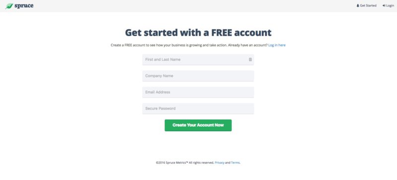
Here’s an early screenshot of the Signup page as an example:
Other than creating an account, and logging in and out, that’s all you can do right now. But that took FOREVER! I’m proud that I got this far on my own. It’s clear I’m going to need help in the future though.
Working With A Team?
Another reason this challenge is scaring the shit out of me is because we thought it would be best to build a small team from the start. I don’t work well in teams (if I had time to tell that story from before, you’d know why).
I told Jason that I wanted to learn Ruby on Rails and try to get the app started. At the very least, it would allow me to understand the framework and I could be the front-end developer making the app look pretty.
Jason had a developer lined up to take over for me as the back-end developer, but then I had a breakthrough!
Coding The Website Screenshot Method
When I first started coding this app I was scared. I thought there was no way my brain would be able to understand how to do seemingly simple things like take a screenshot of a website. But after an entire day of hacking my way through a coding problem, I was wrong.
What you see may seem simple (and it is), but it took me a long time to code. When you add a new website (or click a refresh button), the app will visit the URL you enter and take a screenshot of the site. Then, it stores the PNG file in a folder called “web_thumbnails.”
When I finally figured this out, I was PUMPED! I jumped out of my desk chair and celebrated like I had just hit the lottery. This gave me the confidence I needed to decide to build the first version of the app myself.
What We’re Selling and Why
The intro to this challenge was long, but I feel the backstory was important. I’ve laid out what I have so far and what I’m up against. Now let’s talk about what the final product may look like.
It’s a subscription based web app that keeps track of your online business metrics (traffic, subscribers, revenue, etc.) and displays them to you in an easy-to-understand format.
We haven’t decided on a price yet, but we’re leaning towards three selling options:
- Low monthly subscription
- Discounted annual subscription
- Lifetime subscription deal
The app will be free for invited users with only one site. You will have to upgrade to the paid version to add multiple websites, or perhaps, run one massive site. This is still undecided.
The goal is to have the app available for invited users to buy on October 17th 2016. (I’m saying “invited users” now because we would like to keep the app small at first.)
The Plan
I’ve never built successful software before. I’m building an app based on what I know works for my business, and I’m hoping others will find it as useful as well. I don’t know if anything like it exists in the marketplace and I don’t care. I’ll be happy if, at the very least, it saves me time every month from entering it my business metrics manually.
1. Get a Working Prototype Launched
The prototype is coming along nicely. I’m giving myself a shitload of time on this because I don’t know what kind of snags I’ll run in to.
The goal is to make something useful. The spreadsheet is useful, so if I can just make a glorified spreadsheet, we have something. But I plan on going further. I want the app to pull in data from other software like Google Analytics and Mailchimp automatically. I will not rest until these two apps are integrated.
My goal is to have a working prototype complete by September 18th, 2016. That gives me a little less than a full month.
2. Alpha Testing Stage
Jason has a product called Buy My Future which he is relaunching in September. Everyone who buys it gets access to everything he’s built and will build. So it includes this app.
They will have access to the app first and help us test it out. We’ll find out what people have to say about the initial prototype. We want to know if people like it, first and foremost, and to use it and see its value.
3. Analyzing Real User Feedback
Once we get the feedback we’ll either continue improving the product or pivot. I don’t foresee pivoting, but who the hell knows at this point. I’m sure we’ll get a LOT of feedback that will piss me off, but I’m hoping for the best here.
Assuming that people dig the concept and we keep going on this challenge…
4. Build Version 1.0 of Spruce
People will be using the prototype. We’ll have real-word data to work with. It’ll be time to get this app for sale.
We’ll make improvements, remove features (maybe), and clean up the design. We’ll be deploying the updates to the current users and make sure everything is cool.
This is where we’ll start implementing how people will pay for the app. My plan is to use Stripe integration. I don’t even want to think about this stage yet, but it’s important to make money 🙂
5. Sales and Marketing
Once we have a fully working app that we’re happy with, I’ll start designing and coding the sales page. To start, I’m only planning to have one single landing page with videos, app features, benefits – you know, the usual sales page shit.
Jason and I want to have some fun with this, so who knows what we’ll come up with until we reach that time.
What’s Next?
The plan is simple: build an app, get feedback, improve the app, sell the app. If all goes well, we should make money. If it fails, we have an app to keep track of our own businesses. Nothing to loose here, and that’s the way I like it.
Since this is a 60-day challenge, I will updated less than my other challenges. I will be spending most of my time learning, coding, and testing. Once we have the app for sale, and it’s doing well, we will hire a developer for maintenance and improvements.
I would like to keep this business small and manageable. We’ll see what happens.
17 Days Until Prototype Deadline!
We have a new deadline for the prototype launch: September 15th, 2016.
Unfortunately for the past week, I focused on a coding challenge I was not prepared for: connecting to the Google API. After DAYS of work on this single task, I was able to do it…
But I deleted the code.
Getting Back to the MVP
Adding metrics data can be done manually for the prototype. The prototype is the Alpha stage. The goal is to get people using the app quickly so we can make the right improvements for the Beta stage – launching on October 17th, 2016.
I went back to the design first. Once we get the design to where we want it, we can start making all the pieces work.
This is the philosophy that DDH (the creator of Ruby on Rails) used to create Basecamp – design before programming. The following excerpt is from their first book/guide “Getting Real“:
Design the interface before you start programming
Too many apps start with a program-first mentality. That’s a bad idea. Programming is the heaviest component of building an app, meaning it’s the most expensive and hardest to change. Instead, start by designing first.
Here’s the original design for the “website details” that Jason came up with (see his wireframes above). When you log into the app, and set up your website, this is the page you see:
On the left is the metrics based on last month’s (or year’s) numbers. On the right you see a “Status” box and a “Recommendations” box with links to helpful content.
After building and reviewing this with Jason over Skype, we agreed that it sucked.
Redesigning The Metrics
Jason asked me, “what metrics do you look at the most when you’re finished entering them in your spreadsheets?”
My answer:
- Total Website Visitors: how many visitors did the website get in a month.
- Traffic Growth: the percentage increase/decrease of website visitors month-over-month (and year-over-year for SwimUniversity.com).
- Total Email Subscribers: how many subscribers did the website get in a month.
- Traffic to Email Conversion Rate: the percentage of website visitors that sign up to my email list.
- Email Growth: the percentage increase/decrease of email subscribers month-over-month (and year-over-year for SwimUniversity.com).
- Total Monthly Revenue: the amount of money earned in a month.
- Revenue Growth: the percentage increase/decrease of money earned month-over-month (and year-over-year for SwimUniversity.com).
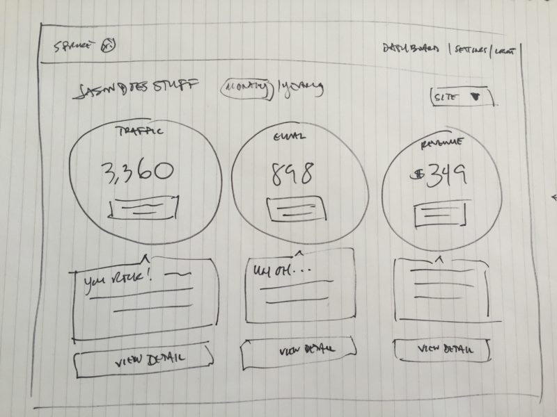
After that, Jason drew up some new wireframes for the “Website Details” page:
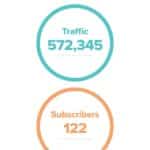
The idea was three big ass circles with big ass numbers in them! Underneath is a “Status Message” of encouragement or focus.
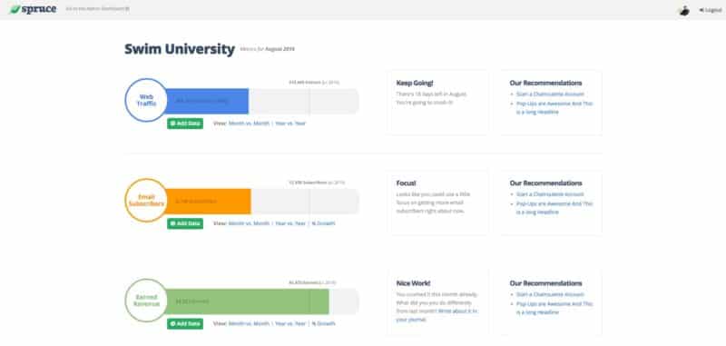
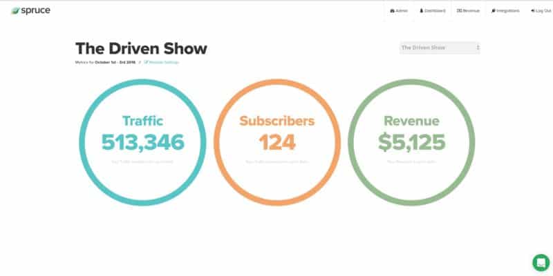
Then, I coded that in HTML and CSS (the colors are based off the original color scheme of the spreadsheet):
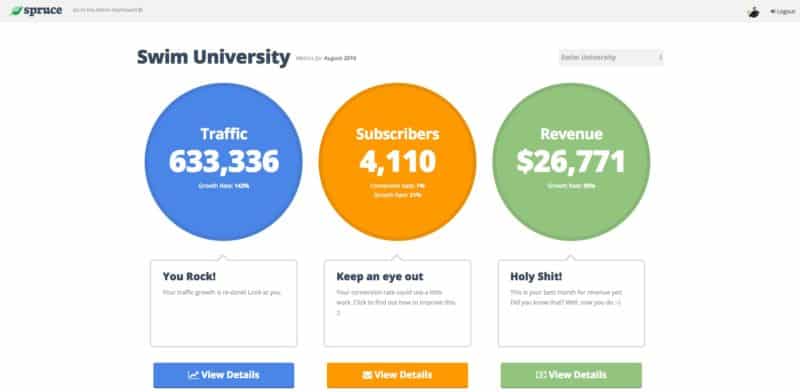
The resigned “Website Details” page
Because I’m deep in this project, it’s hard for me to see the value in this simple view. But the truth is, it’s hard to get this data all in one place. Hence the reason I use the spreadsheet right now.
This is the overview for a single website. If you click the “View Details” buttons (or the big ass circles themselves), you’ll be sent to another “Details” page, breaking down each metric.
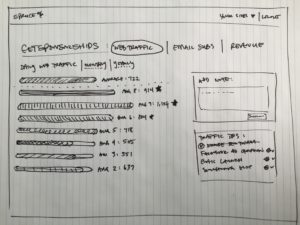
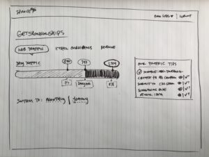
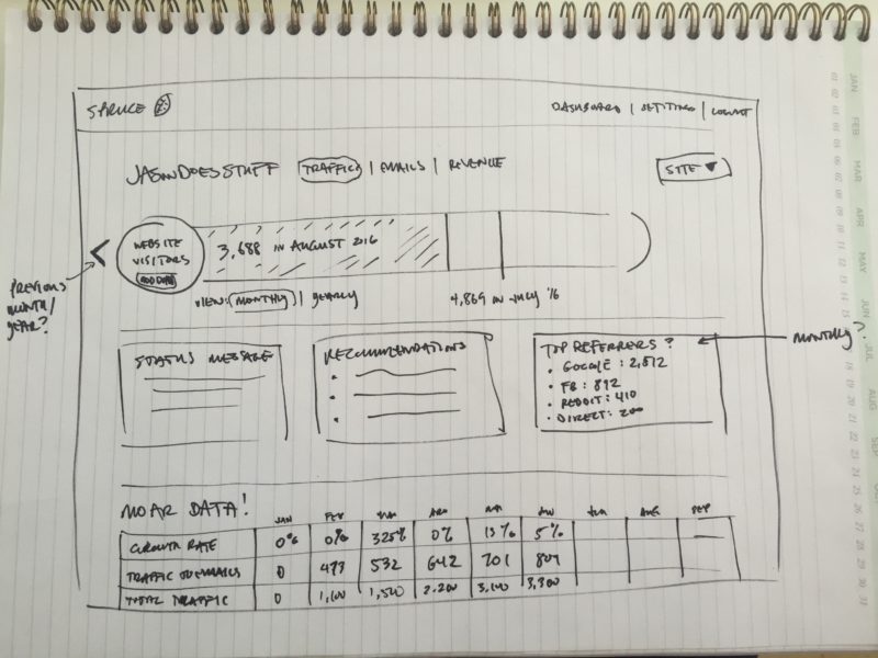
Here’s Jason’s original wireframe for the “Traffic Details” page:
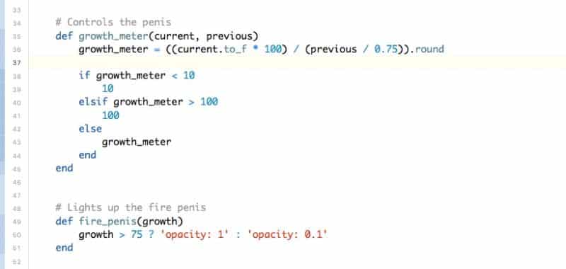
We kept the “thermometer” (or what I call the “penis” – I turned 33 last week) across the top of the page. You can toggle between traffic, email, and revenue. And between multiple websites (if you pay for the app).
Underneath the “penis,” there are three boxes: Status, Recommendations, and…huh?
We brainstormed what to do with that third box and came up with the “Journal.”
You can write quick notes based on your metrics for the day/month/year. These entries will be stored to your website and categorized depending on the metric. We’re still fleshing this idea out, but I think this will be very valuable. I know it will for me personally.
Under that is the “Spreadsheet View” incase you want to see that.
What’s Next?
I’ve designed and coded what the metrics will look like. Now it’s just a matter of creating some database tables, entering some fake data, and making the app work flawlessly.
Easy, right?
I’ll be happy if the prototype works without the ability to connect third-party apps like Mailchimp and Gumroad. We want to make sure we get this into people’s hands and get some feedback before we add more functionality.
For now, I’m diving into hardcore code mode 🙂
11 Days Until Prototype Deadline!
It’s been a week since my last update, and I’m not as far as I’d like to be in the programming process. But of course that’s the case, right?
I’ve had to jump on Skype several times with Jason just to keep myself on track. This is because I don’t have a good to-do list (this coming from the guy who made a video course about Asana). It’s been a struggle to move forward.
Destroying My Legos
When I tackle a coding project for Spruce, I just do what it takes to make it work on the page. I look at it and think, “sweet, it works!” Then, like clockwork, I notice a flaw in the code. Either I built a house of cards, or I found a better way to execute the same code in a cleaner fashion. So I destroy what I’ve built and start over again. This time, though, I get it right.
This is learning, but it sucks. I have to do everything twice: once to see it work, and again to make it better. Sometimes I’ll do it a third time if a new idea hits me.
When I told Steph about this process, she showed me this TED talk:
Here’s the part I’m referring to:
We asked people, “Would you like to build one [Lego] for three dollars?” And if they said yes, they built it. Then we asked them, “Do you want to build another one for $2.70?” And if they said yes, we gave them a new one, and as they were building it, we took apart the one that they just finished. And when they finished that, we said, “Would you like to build another one, this time for 30 cents less?” And if they said yes, we gave them the one that they built and we broke. So this was an endless cycle of them building, and us destroying in front of their eyes.
This is what it feels like…kind of.
I’m Not Going Insane
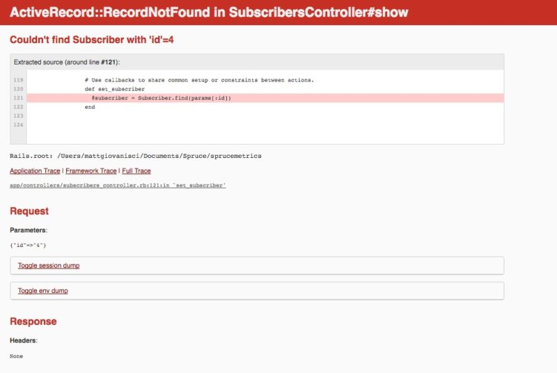
As Einstein put it, “Insanity: doing the same thing over and over again and expecting different results.” The good news is, I’m getting different results, so I’m not insane. But it’s still blows, especially when you constantly see screens like this:
Progress is being made, but it’s slow at the moment. The other good news is that I have a very clear path towards the prototype. And once I master the Traffic portion of the program, the rest is just copy and paste.
SCRUM?
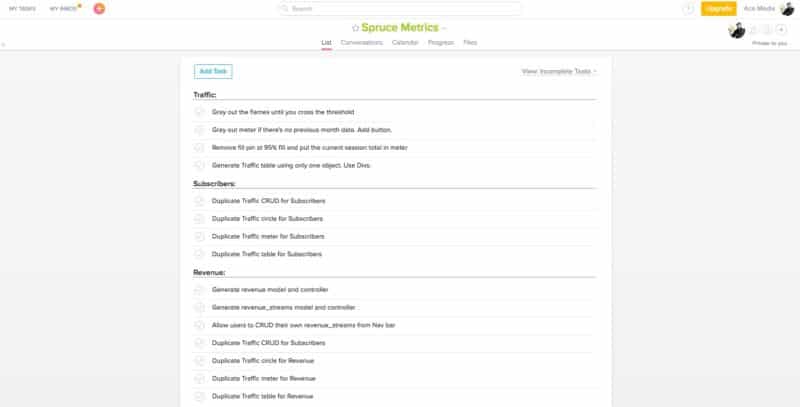
I was talking to my buddy Zack who reminded me about SCRUM. I didn’t dig into the details of it because I don’t have time to learn anything new, but it kicked me in the ass to put together a real fucking to-do list using Asana.
I really think this will speed things up. I will only work on what is in this list. Everything else is bonus. I want to have a working prototype that’s coded very well. So if that means working overtime to get it right, then so be it.
I hope that my next update will have a video walkthrough of the prototype 🙂
Also, I’m having fun…
7 Days Until Prototype Deadline!
I had a chat with Jason over Skype about where I’m at with the software. We also go on a tour of what’s been developed so far.
Getting Down and Nerdy
I will not shut up about how hard this challenge has been. And I would like to get a little technical. If you’re not interested in programming, I suggest you skip this.
I’ll give you a minute…
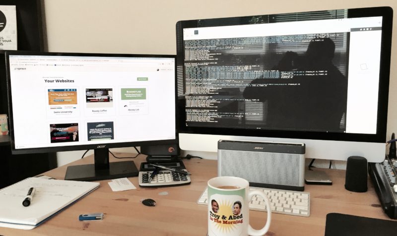
I’m coding on my iMac with two screens and I’m using Coda 2 for Mac as my text editor for coding. The two screens has been important because I’m a visual coder. I’m not running “tests.” I’m just refreshing the browser every time I make a change and praying it works.
My Learning Platforms and Resources
When I first started coding this app, I learned everything from Lynda.com. They have a great Rails 4 course, and even though I’m on Rails 5, it’s still been helpful.
Lynda got me started. I was able to code a way for users to signup, login, and logout of the site. Then, I started getting into the app itself and I realized that Lynda wasn’t cutting it. I thought I would be at the mercy of StackOverflow.
I signed up for TeamTreehouse.com because I found some of their videos while Googling Ruby questions.
Their Ruby tutorials are PAINFUL to watch. Like, excruciating! However, they’ve been helpful, and turned me on to a new way of dealing with users. But this caused me to start the whole app over again.

Wipe that shit-eating grin off your shit-eating face!
Learning to Start Over
Starting over sucks. I talked about this in my last update, but I want to explain what happened.
Because I’m using two different learning platforms, I was bound to get conflicting advice. None of it’s bad, just different. Some advice is better, and that’s what happened with moving from Lynda to Treehouse.
I built this entire system to login and logout users, but I learned there was a popular Ruby gem (like a plugin) that did a lot of this work, and better. So I deleted all my code and started over.
This was for the better, but it sucked.
Driving Revelations
There was a moment on my way to a dinner date with Steph in Denver when it all clicked for me. In that moment, I finally understood the real value of MVC (Model, View, Controller). This is a popular architectural pattern for implementing user interfaces.
I thought I understood it, but it didn’t click until I was trying to solve a problem in my head while I was driving. This has been happening a lot.
Taking frequent breaks has been the key to rapid development.
The Paradox of Getting It Right
My other problem is perfection (coincidentally, the name of a song a wrote in 2004). I don’t like sloppy code. I want the software to look and function well, but I’m perfecting unnecessary areas.
I want it to be right. This is what I’ve been taught my entire life, but this mindset is slowing me down.
It’s important that this software ships on time. I have never missed a Money Lab deadline, but I also never coded software with Ruby before.
In the video above, Jason says, “this is allowed to be hard.” I’m learning a new language.
You can’t expect to just go to Japan and hangout in Tokyo, eat a couple bites of Sushi, and expect to be fluent in Japanese.
That’s why I’ll working hard to get out the prototype myself. I feel as though I can create a workable program, but I will need help once it’s out there.
The Biggest Roadblock
So far the largest obstacle has been displaying dynamic tables of data.
I had to call in a friend to help figure this out. I spent about two days working on the Traffic data table and got NOWHERE. This was frustrating. Steph convinced me to reach out to someone.
I want to thank Brandon, The Mad Fientist, for solving this problem for me. He’s been a Rails developer for over 10 years and he saved this prototype!
But, now I’ve run into a new problem: the Revenue table. This table is more complex because it involved nested loops.
I understand logically what needs to happen, but I don’t understand the language enough to make it work. I will be spending ONLY one more day on this issue before I reach out for help again.
Already I’ve learned that it’s okay to ask for help. It goes against my stubborn do-it-yourself attitude, but it’s been life-saving.
The Adult Diaper Phase
Stephanie went out of town this weekend. I have the whole house to myself and I’m taking advantage of it. I’m spending the next few days glued to my computer.
I stocked up on food and water. I got everything I need and I don’t have to leave the house all weekend.
My goal is to get the prototype FINISHED before Steph comes home – which will be 3 full days before September 15th.
PS – Don’t worry. I won’t be using an adult diaper. It’s just a joke. There’s a bathroom two feet from my desk.
1 Day Until Prototype Deadline…
…and I’m going to miss it!
My “Adult Diaper” phase did not go as planned. It started off well. I was able to make some major strides – including the ability to connect to Google and update the traffic data.
Then things fell apart.
The app became overwhelming and I felt myself shaking from stress. Hours later I was on my couch, covered in a blanket, and watching Parks and Recreation to ease my stress.
I’m not joking.
The Meltdown: What Happened?
I don’t have a good understanding of object-oriented design. I knew what the outcome needed to be, but I was trying to be a fortune teller at the same time. Trying to predict how the other APIs would apply.
Because I don’t understand the fundamentals of building a scalable app, I freaked out. I don’t like feeling out of control Things didn’t work and I didn’t have the answers.
Google Vs. Mentor
I realize now that I need a serious mentor, or at least a few programmers I can talk to. Since I don’t understand what needs happen, it’s impossible to Google the answers.
The day after filming that video, I felt calm and ready to try again. But instead of just diving into the unknown, I reached out to a programmer Jason introduced me to, Thai Wood.
Getting Through Two Road Blocks
First, he helped me create the Revenue table, which turned out to be a bit complicated. Not sure I could have done this on my own.
This was harder than the Traffic and Subscriber tables because it involved Revenue Streams.
The Traffic and Subscriber tables only had to pull from a single record in the database.
Then, he helped me with planning out the Google API connection. Even though I wrote the code already, I knew I was storing it in the wrong places. It wasn’t scalable, and it would all break if I added more APIs, like Mailchimp.
He helped me understand how the app would play with the API and introduced me to a Ruby Gem that helped. It turns out I was coding an OAuth connection from scratch when I didn’t have to. I used the Ruby Gem to do a lot of this work for me. What a life saver!
Missing the Deadline
I’m not happy about missing the deadline. I don’t miss deadlines. But right now, the app does NOT connect to any external APIs efficiently. The data is still entered manually, and this is not the core of what the software should do.
And even though I’ve made progress on the APIs connections, I’m still doing it wrong.
I bought a book that I think will help me, and I’m chatting with Brandon, the Mad Fientist, and Thai again. I need help planning out the future of the API connections. I believe that if I understand how they will all work together, I can crush the code writing and have the app done by early next week.
I hope this all works out and I can deploy the prototype soon 🙂
Prototype Launch!
It’s 9 pm on September 19th and I just finished a video on how to use Spruce for a small group of Alpha testers. I can’t fucking believe I built a working web app in a programming language I knew NOTHING about last month.
I’m pretty damn proud of myself right now and I don’t care who knows it.
Picking Up Some Self Confidence
Last week, I went through a rough patch. I felt overwhelmed with the scope of this project and I didn’t have a firm grasp of Ruby.
I finished reading, The Innovators by Walter Isaacson and I needed another book. I decided to read Practical Object-Oriented Design in Ruby. It’s been an amazing and eye-opening read!
I was having an issue on how the app would integrate with third-party apps. This book would have solved my problem if I hadn’t figured it out beforehand.
I Just Shipped Myself!
Jason and I debated whether we should ship or not. Meaning, the software isn’t ready and I’m uncomfortable putting it out there. But I heard that you SHOULD feel that way.
I thought it was important to get people using it sooner than later. We don’t know if people will like what we’ve built so far, and if we’re correct in assuming what people want.
Jason is sending it to a handful of Alpha testers who know the drill. They know the software is just a prototype built by a man with little coding experience.
Tomorrow, I start work on the pre-launch landing page to capture some emails before I head off to San Diego for FinCon. I’ll be away from my computer for a week while real people are using the software, and that scares the shit out of me.
I’m scared of a lot of things.
What The Prototype Can Do
Here’s a quick overview of what the app can as of September 19th 2016:
1. You can sign up and login/logout
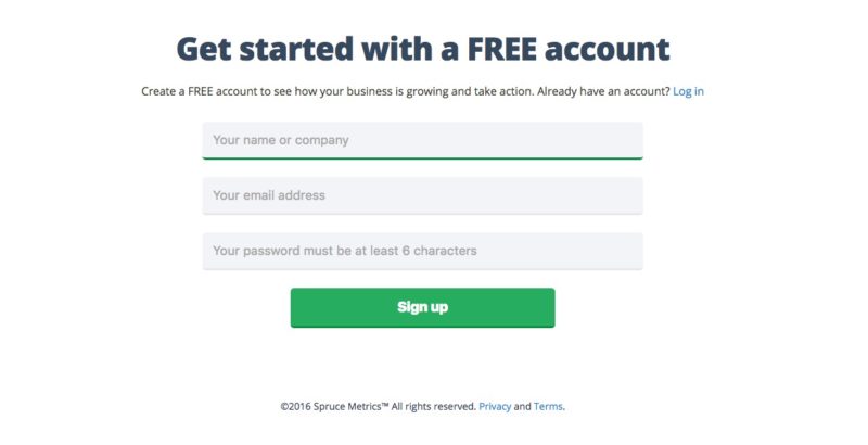
The Create Account Screen
2. You can add as many websites as you want
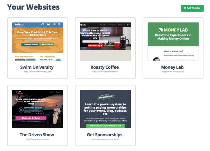
The Dashboard where you can add as many sites as you want
You can add one website or many. We’re thinking that if you want to add more than one site, that will be a paid feature.
3. You can manually add data for website traffic, email subscribers, and revenue (categorized by revenue source)
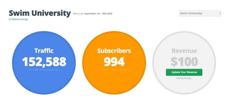
Website page where you can add data manually
When you click one of your websites, you’re taken to this screen where you can see all your data for the month (from the first day to yesterday). If you integrate your site with services like Google Analytics and Mailchimp, these circles will update themselves.
Otherwise, you can manually add and update the data yourself.
4. You can connect to your Google Analytics and MailChimp accounts
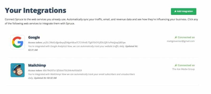
Connect to a Google Analytics or Mailchimp account
This was the hardest part of the software, but right now it’s the most useful. You can connect to a Google or Mailchimp account.
If you have multiple web properties in Analytics, or lists in Mailchimp, you can connect them with the websites you’ve added to spruce.
5. You can bulk import your traffic and subscriber data
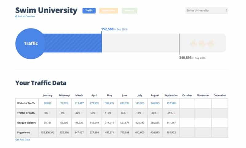
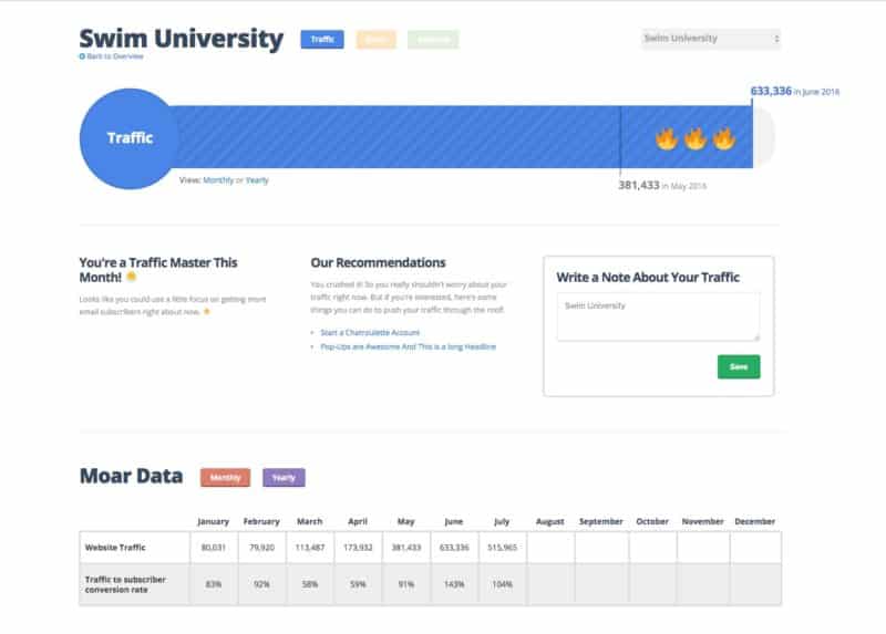
Traffic Page for Swim University
With the click of a very small and well-hidden button, you can automatically add data for the last 12 months. Clicking this button takes a minute to run, but you only have to click it once.
This will be a feature built into the app when you first connect your accounts.
6. You can track your Revenue by source
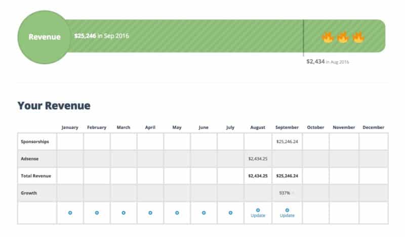
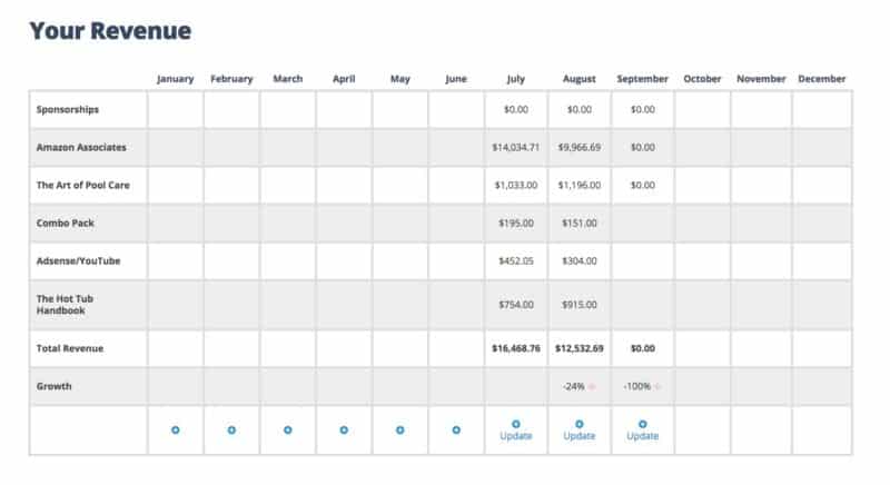
The Revenue “Penis” and Table for Swim University. This data is fake!
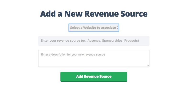
Instead of just lumping all your earnings into Revenue, you can split them up by Revenue Source. A Revenue Source can be a category like “Adsense Earnings” or a product like “Asana for Bloggers Course.”
These sources are totally up to you. You can think of them like categories for revenue, and you can have as many as you want for each website.
“Remember, This Is Just The Prototype!”
This is something I have to constantly remind myself of. This software is bare bones, but we have big plans for it.
Right now we think that seeing this data in one view will be powerful. Most website owners haven’t seen their data displayed like this, and it’ll be interesting to see what they’ll want this software to do.
Our guess is more education on how to use these metrics. Jason and I think that will be the secret sauce of the app.
Now that phase one is complete, I feel pretty relieved. However, there will be bugs! I’m scared of bugs. All of them!
What do you think of the app so far? You can comment below.
18 Days Until The Spruce v1.0 Launch
We’re still shooting to launch the first real version of Spruce on October 17th 2016.
A week ago we launched the prototype to a handful of alpha testers. We had 27 people create accounts and 40 websites.
During that time, I flew to San Diego to attend FinCon16 – a conference for financial bloggers because I used to be one. I told Jason to keep me in the dark while I was away from my computer. I didn’t want to hear about bugs or problems because I couldn’t do anything about it.
In fact, Jason and I met up #IRL and he kept his promise. As of this moment, I have no idea what the feedback was via Intercom. (BTW, we hooked up Intercom.com to get feedback in real-time.)
NOTE: Right before I left for FinCon I managed to put up a pre-launch landing page.
I’m going to take a break from writing and read some of the feedback so I can share it under the next sub-heading.
The Alpha User Feedback
Overall the feedback was positive! This is not surprising since most of the users are part of Jason’s community and knew the deal going into it.
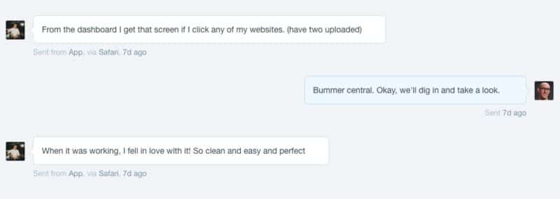
Out of 27 users, only a third provided feedback. Here are some screenshots from Intercom:
Not bad. Only a couple of bugs. Overall, a lot less than I thought there would be. Also some good ideas, too.
“I’m fucking done with integrations!”
Once I got back home, Jason and I jumped on Skype to talk about the next steps. I asked him how he felt about the feedback and what we needed to work on next.
Besides cleaning up the existing code, which I know needs to be done, he mentioned more API integrations. I could feel myself stressing out. I finally said OUT LOUD,
I’m fucking done with integrations. I don’t think I can code another integration. I have no desire and I would rather work on something else. Dunzo!
Coding integrations was the single cause of my anxiety. I spent days laid out on the couch trying not to think about the software.
I finally admitted that I needed help.
Welcome Aboard, Thai!
Thai Wood is a developer I’ve mentioned during this challenge. He was a part of Jason’s community (BuyMyFuture.com) and agreed to help me over Skype.
But now he’s a part of the team. In fact, he’s a part owner of Spruce! Now there are three 🙂
We all jumped on Skype to briefly discuss the new partnership and mission almost immediately after I admitted defeat. We set up some new systems:
- We’re using GitLab instead of GitHub because they offer free private repositories.
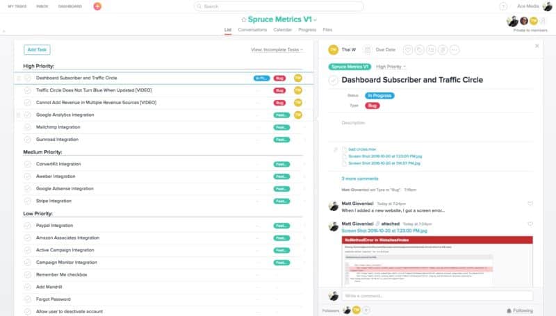
- We’re using Trello to keep track of feature updates.
- We’re using Slack webhooks to keep us in tight communication.
- I had to learn Git better because now I’m working with another programmer.
Roles have also shifted. I’ll be focusing more on front-end development while Thai handles back-end.
Next Steps
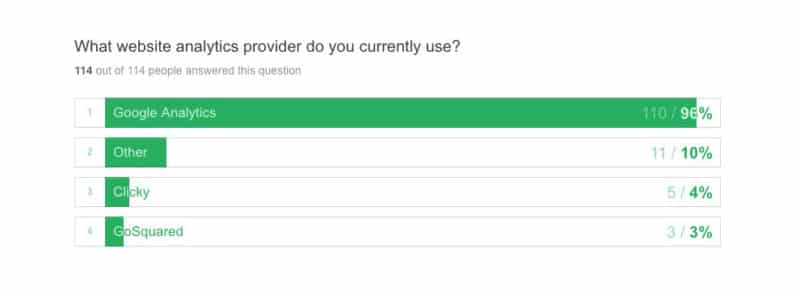
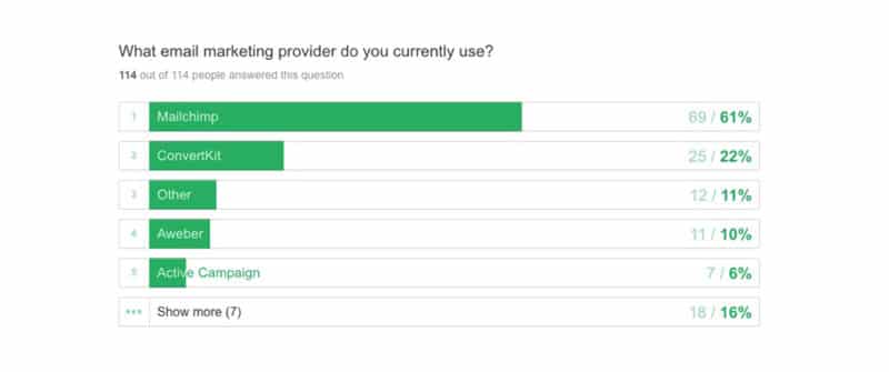
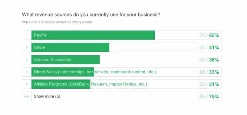
Some of you may know that I sent out a short survey to find out what software services you use to manage your website business. The goal was to find out which integrations were important to have for the launch of the first version. Here’s the results from TypeForm:
So here’s the integrations we’re hoping to have in the first version of Spruce:
- Google Analytics
- Mailchimp
- ConvertKit
- Aweber
- Active Campaign
- PayPal
- Stripe
- Amazon Associates
- Adsense
- Gumroad
Refining The Features of Spruce
Finally for this update, I’d like to share a snippet of a Google Doc we’re working on. This doc includes the full scope of what Spruce will be when it launches. I won’t share the whole thing, just the description I wrote. I think it’s nice to see this as a reminder of what we’re building:
Simple analytics to help you grow your business. Spruce allows you to add a website you own and keep track of important analytics without logging into multiple accounts to see how your business is doing.
Spruce will show all your business metrics in one location including, website traffic, email subscribers and revenue. You can manually enter the data yourself or allow Spruce to automatically connect to third party apps you love like Google Analytics, Mailchimp, and PayPal.
On top of that, Spruce will analyze your metrics and provide on-demand recommendations on how you can improve your business. If your traffic isn’t growing from month to month, for example, Spruce will deliver educational content and recommendations you can implement to help move the needle on your website and increase your overall revenue.
“The Mint.com of business analytics.”
Who it’s for: Solopreneurs, entrepreneurs, online course creators, digital product creators, small business owners, people who don’t love HATE analytics.
Now back to my Hobbit hole!
14 Days Until The Spruce v1.0 Launch
After bringing Thai on board, things got a little wonky. This was expected since he came on in the middle of the project.
One of the reasons we needed Thai was because of the app integrations and future growth. We believe the success of the software hinges on having lots of integrations. However, it’s even more important that the app has a solid foundation, and I’m not confident in that since I hacked the prototype together.
We had a couple Skype chats, but I still felt things were a bit all over the place.
Coming Up With a Concrete Launch Plan
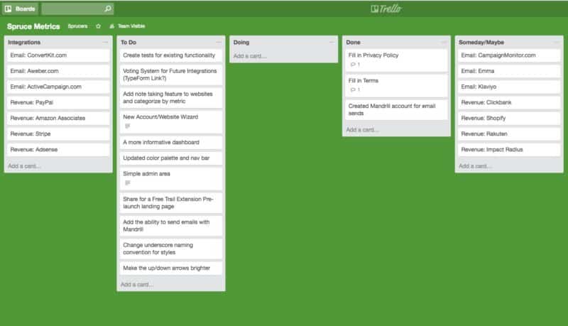
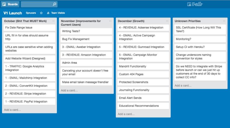
As you know, I’m an Asana user. However, Jason and Thai are not. So we decided to try Trello. This is our first Trello board that was quickly abandoned.
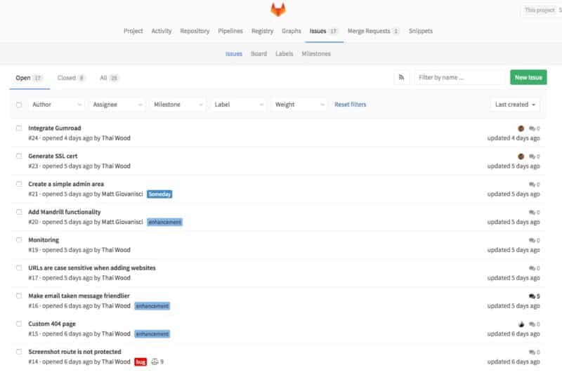
Then, when Thai had our code moved from GitHub to GitLab, he set up a bunch of issues based on the Trello board, and his own findings after sorting through the code.
So now we were working with two different organization platforms. No bueno!
I suggested we move away from Trello since we weren’t using it, and instead just use the issues tab in GitLab. After a few days though, I knew this wasn’t going to work either. And to be honest, we’re still figuring this out.
I sat down with Steph one night to help me layout a concrete plan for version one.
We took the current bugs and features we wanted, and put it in a giant list. Then we pruned it down to the bare essentials and added back some features we felt were necessary for launch.
I used Trello again so everyone on the team could see it, but we’re not using this to manage progress at the moment.
Then, I sent this board to the team with the following explanation:
October is the crucial month (even if we push back the deadline). This is where the software should work flawlessly. Bottom line: users should be able to add websites and data manually without any hiccups. This is why the Wizard is more important than integrations for the month. Hopefully a solid foundation will make integrations easier.
November is when people are actively using the software. We should be prepared for backend and frontend bugs, and quick to fix them. This is also a good time to scale up. Anything that can be done manually, should be done manually. If the ability to take Stripe payments, for example, may take a few weeks, this is the time we’ll do it since most people will get a 30-day free trial anyway. This buys us time.
December is when we can start adding in all those fun features and scale up from there for the rest of time. Hopefully by then the software will run smoothly and we’ll have a decent amount of integrations.
Everyone responded positively and now we have a solid plan for V1!
Redesigning Spruce
Now that Thai’s on board, I’ve been focusing on redesigning the user interface (UI). I liked the leaf icon, but not the font in the original Spruce logo. Jason and I both wanted something sexier, and the logo wasn’t working.
I’ve been obsessed with the modern rustic look since moving to Colorado. I’m a huge fan of a local coffee shop here in Boulder called Alpine Modern. They have a store where I bought this:
I named him Scout and I paid $75 for him.
Alpine Modern used to print an awesome magazine, too. I was lucky enough to get my hands on a few issues before they stopped printing. This magazine has been a design inspiration for my house, and now Spruce.
I also bought a book called Cabin Porn (made by one of the guys who started Vimeo). The book is dope as hell, too!
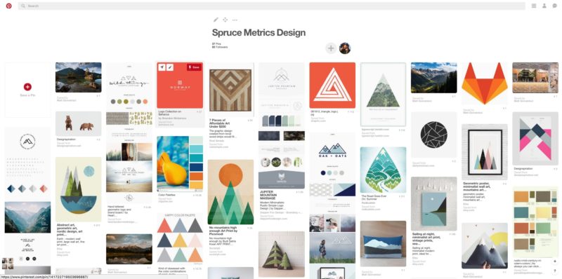
I continued to find design inspiration by starting a Pinterest board (I forgot how useful Pinterest can be). I started collecting a bunch of photos and design elements I liked from Alpine Modern and moved into more rustic modern themes and colors.
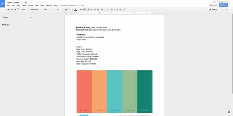
From this board, I started to put together a “style guide” in a Google Doc. This is where I’m storing hex colors, fonts, and anything that needs to be documented about the design.
Finally, it was time to start putting these design elements into place.
The first thing I did was redesign the logo and based everything off that.
As you can see, I kept the leaf icon but changed the colors and font. The colors are based off this image.
The first page I designed was the “Website Details” page along with a new navigation bar. I wanted to get the colors right for the circles before applying it to the rest of the design.
As for the rest of the layout, I put together a photo gallery:
The one last design feature I added was a mascot. This is a graphic I created based of my new expensive stuffed animal friend, Scout.
The mascot for Spruce will be a fox named Scout and he will be popping up all over the place to help you 🙂
6 Days Until The Spruce v1.0 Launch (Maybe…)
For the past week, I’ve continued to design Spruce. My main focus has been making Spruce responsive.
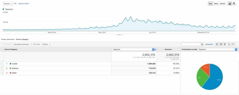
My website SwimUniversity.com – with an average visitor over the age of 40 – views the site on a mobile device. A mind blowing 60% in fact!
This is why it’s important to make Spruce mobile-friendly.
Making Fun of Spruce
I’ve also been working on ways to make Spruce more fun. This is important stuff.
love that stuff. Asana does a great job too. @MattGiovanisci we need LOTS-O-FUN in Sprucemetrics 👍🏼 🐺
— Jason Zook (@jasondoesstuff) October 5, 2016
With this is mind, I had an idea for another character to join Scout the fox. I’ve always has a weird obsession with lumberjacks, and what better friend/foe for an app named “Spruce,” right?!
I’m not a great illustrator, but I was able to make Scout. So I tried making a lumberjack illustration without any help. I got pretty far, but Steph had to help me with the arms (she’s a cartoonist, look here).
Introducing the newest member of Spruce:
I’m happy with the way he came out. He’s illustrated in a similar style to Scout, which makes them buds 🙂
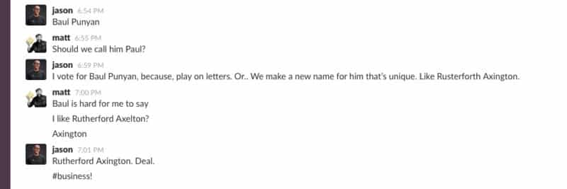
Then, we had to name him. Here’s a brief transcript of our business meeting during this important decision:
Since he’s a lumberjack, he cuts down Spruces. So it made sense that you’d only find him if there’s a problem – like a 404 page:
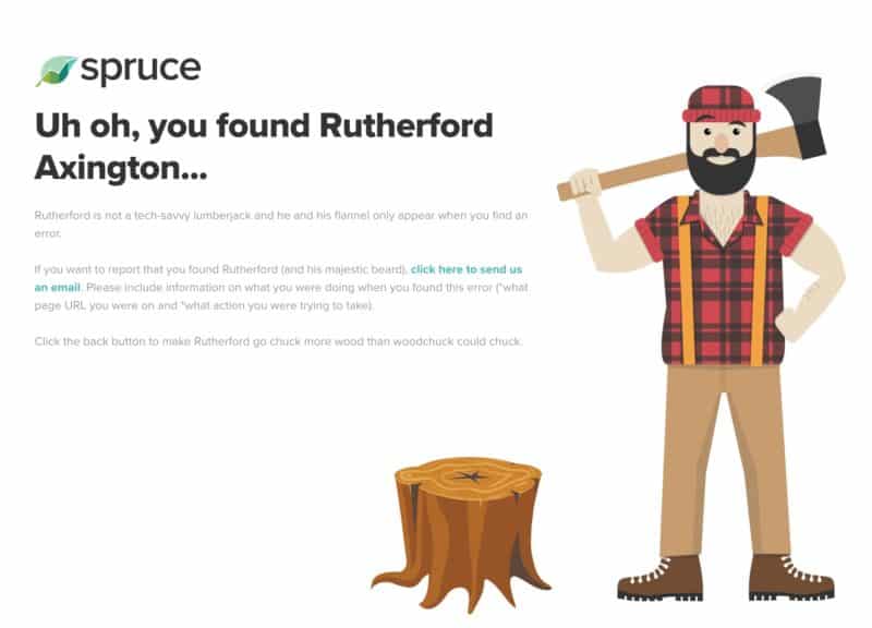
This is what all error pages look like on Spruce. This is the 404 page.
Communication is RIDICULOUSLY Important. Holy shit!
My relationship with Steph is solid because we communicate. But even though I’m good at it in my personal life, I suck at it when it comes to my business life.
Yet, every time I calm down and communicate, I feel better and things work out. Funny, right?
Jason and communicate well, but this week he’s on an island somewhere – that son of a bitch!
https://www.instagram.com/p/BLUaCD4AN1K/?taken-by=jasondoesstuff
So right now it’s just me and Thai working on the software, and we’re doing our best to communicate through Slack and Skype.
Pushing Back the Launch Date
This was a tough call for me, but we’re pushing back the launch date to October 31st.
To start, Thai only requested another week, but I like significant – in this case, Halloween. He’s been pouring over the code, and there’s too many errors and bugs.
From the beginning of this project, I’ve stressed the importance of having a solid foundation for the software. However, I didn’t build a solid foundation because I’m a total n00b. This is all my fault 🙁
I wanted to prove that ANYONE can code a SAAS product with little experience. Even though the software was rough, it worked. And with more than 60 days (and a simpler app concept), I still believe it can be done.
That said, if Thai had been on the team since day one, I doubt we’d be pushing back the launch date.
Making The App Super Kick-ass!
The good news is, I think Thai has a real solid grasp of the software now. From this day forward we’re going to make some serious progress.
The app is looking and functioning better each day. Thai is finding and fixing problems with speed. And it’s only a matter of time before we can start working on the marketing side of things. Which I’m very excited for.
And more than that, I’m excited to use the software for my own websites soon 🙂
This Challenge is (Technically) a Failure…Let Me Explain
When you have goals, sometimes you fail. That’s just the reality of having goals and deadlines. So I expected this.
I gave myself 60 days to complete this challenge and there’s nothing for sale. But that doesn’t mean this project is a failure, just my self-imposed deadline.
In fairness, I was able to build a working prototype in a little over 30 days. And if I stuck with it, I bet I would have successfully completed the challenge. Or if Thai was on board from the beginning.
To be crystal-fucking-clear, I’m NOT stopping this project. I’m merely reflecting on the 60-day challenge itself and what went wrong.
What Went Wrong During This Challenge
I tried to build a complicated web app with no experience or previous knowledge in Ruby. Had I coded the app in PHP (a language I’m familiar with), things would have gone differently.
I gave up I wasn’t having fun anymore. And that lack of fun was stressful and impacting my personal health. The fun disappeared when I started coding with the Google API, and the thought of having to work with more APIs. At this stage in my coding experience, it was beyond my capability.
Learning My Strengths
I can make music with my eyes closed. I can put together a viral video. I can design a website like a motherfucker. I’m good at these things because I’ve spent more time on these skills than any other.
This challenge was beyond my current skill set, but it’s forced me to learn a new skill. As I continue to build Spruce, and other apps in the future, coding will be like my music, video, and website building skills. As long as I keep at it, and I plan to.
What’s Next For Spruce?
I will continue to update this challenge as we finish building and launching Spruce. We recently set up an Asana project (YES!) so that we can all keep track of the progress of the app.
I decided to pay for Asana (again) to bring Thai and Jason on board, and to take advantage of the new Custom Fields feature. I’m very aroused.
We’re still hoping to launch in Early November. I’ll keep you posted 🙂
Meanwhile, Jason and I are working on a mini-project to help market Spruce that’s a little more in my wheel house. Check it out here.
The New Launch Timeline
For Halloween this year, I dressed up as our 404 page character Rutherford Axington (and I’m holding Scout)!
..and now let’s be serious 🙂
As Thai continues to work on the app, Jason and I are working on the marketing plan. We have a new timetable for the official launch:
- October 31st 2016 – Referral signup pre-launch landing page.
- November 7th 2016 – Version 1.1 is ready for alpha testers to try.
- November 14th 2016 – Open founding memberships for two weeks (one-time, lifetime access).
- November 28th 2016 – Close founding memberships, create “wait in line” lead capture for two weeks while we make sure paying customers are happy and not causing issues with the software.
- December 12th 2016 or January 2017 – Open monthly memberships to a handful of people, 20-30 spots (or just open to public).
October 31st: The Pre-Launch Landing Page
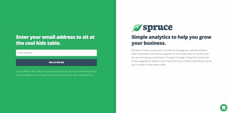
Jason came up with a great idea: a pre-launch landing page where interested visitors can sign up to get on a waiting list. This automatically gets them a free 14-day trial (two weeks) when the app is launched.
After they enter their email, they’re taken to a “Share Dashboard” with a special referral URL. If they share that URL, and another person signs up for Spruce, they’ll earn an extra seven days on their free trial giving them 3 free weeks.
I had to update my copy of Screenflow for $34 to make this video. I did all the screenshots in ScreenFlow and editing in Adobe Premiere. I got the music for free from the YouTube Audio Library, and used Adobe After Effects for the Spruce logo fade in.
They can keep earning, too. Let’s say you sign up on the Spruce Pre-launch page and get your referral URL. Then, you share it on Facebook and Twitter, and five of your friends sign up. This will earn you seven free weeks of using Spruce when it launches to the public.
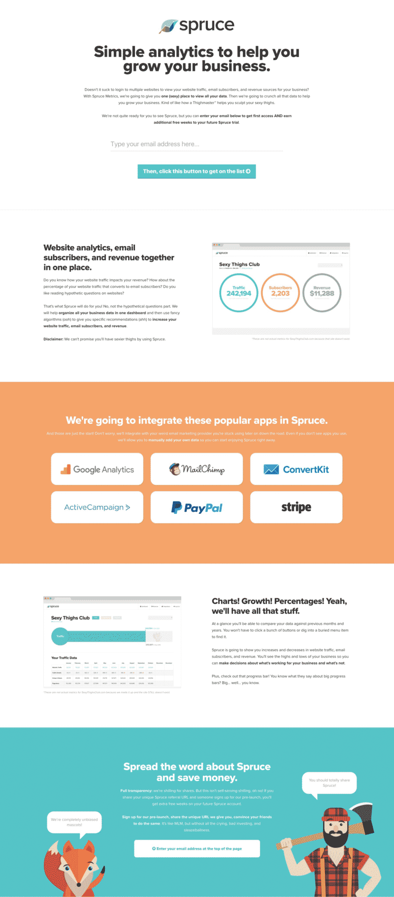
The page is currently live as of October 31st 2016 and will be there until the middle of November. Here it is: http://www.sprucemetrics.com/.
Here’s a big-ass screenshot of the full landing page, too:
I personally designed every inch of this landing page in Coda 2 for Mac. I get asked a lot about what “themes” I use. I don’t USE “themes.” I make them from scratch 🙂
When you signup, you’re automatically added to our Mailchimp account. I used the Mailchimp API to accomplish this. Then, if you signup with someone’s referral code, it’s added as a merge field in Mailchimp.
When this is over, we’ll manually count how many free weeks each subscriber earned and apply it to their account. I know this is insane, but it’s the only I could accomplish this task in a short period of time. Ok, Dad?!
November 7th: Version 1.1 Launch
Hopefully by November 7th, the app will be ready for alpha testers again. It’ll be similar to the prototype except for the new design and the fact that it’ll work much better.
I’m hoping to get at least 50 people using it. We’ll hand select testers to really give the software all they’ve got.
During this time we’ll be on call to fix any bugs that pop up. I have a feeling this might be an intense week. We’ll see.
November 14th: The Founding Member Price Model
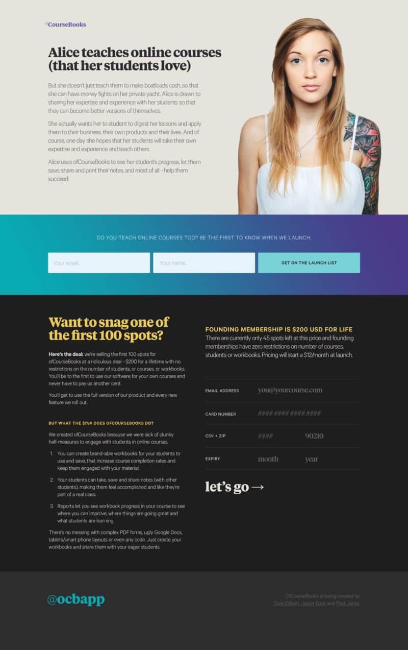
We’ll open Spruce to the public with a unique price option. For a limited time we’ll ONLY be offering access to Spruce for a one-time fee of around $200-300. This will give you lifetime access to the software with no restrictions. You’ll get to use the full version of Spruce and every new feature, forever.
Jason did this with his last software project called OfCourseBooks.com. Here’s a sample of what their landing page looked like during the pre-launch phase:
November 28th 2016: Close Founding Memberships
At the end of November we should have a decent user base. This will be free alpha-test users and “founding members.” We’ll start collecting user feedback and build out new features to get the software ready for a public launch.
I’m calling this the beta test phase.
The Official Launch Date
We COULD launch right after the beta test phase sometime in December, but that just feels like a bad time to launch a product like this. So we may end up waiting until early in the new year.
This is when people will really be focused on growing their business. I’m sure it’ll be on a lot of New Year’s resolution lists.
However, we still haven’t decided on whether the official launch will be wide open or invite only. I’m personally leaning towards invite only. Not because of some dumb marketing trick, but because I want to keep the user base small and manageable at first.
If we open it up to everyone, it’s possible we could have a lot of customer service to handle. So I rather scale up slowly and manageable.
I’m just excited to start using the software myself and marketing it. Now that we have the pre-launch landing page done, I’ll be back to focusing on the SEO Impossible experiment.
We’re Getting Sooooooo Close to Launch
This past week I took a mini vacation up in the rockies with Steph. I didn’t bring a laptop. I didn’t work on anything. I mostly ate and drank and talked. Here’s some photos:
Right before I left, I made the pre-launch landing page live and we got about 75 email addresses so far. Both Jason and I have not promoted it except for this post.
Meanwhile, Thai and Jason were getting shit done on Spruce! Thai got all the integrations working which include Google Analytics, Mailchimp, and Gumroad. Jason was helping with testing and project management.
I know this because I secretly checked Slack on my iPhone in the cabin. Shhh!
November 7th: Version 1.1 Launch
As I’m writing this, it’s November 7th and we didn’t launch to the alpha users. The biggest hold up is the wizard.
A few weeks ago I coded the front end for a walk-through wizard. This is for users who are just getting started with the software. You can add a website, traffic data, subscriber data, and revenue all in a single flow.
We thought wiring it up would be easy, but that wasn’t the case. We’re gonna need a few more days to get it ready.
I’m still hopeful we can launch this week though. Just a few days later than we thought.
November 14th: The Founding Member Price Model
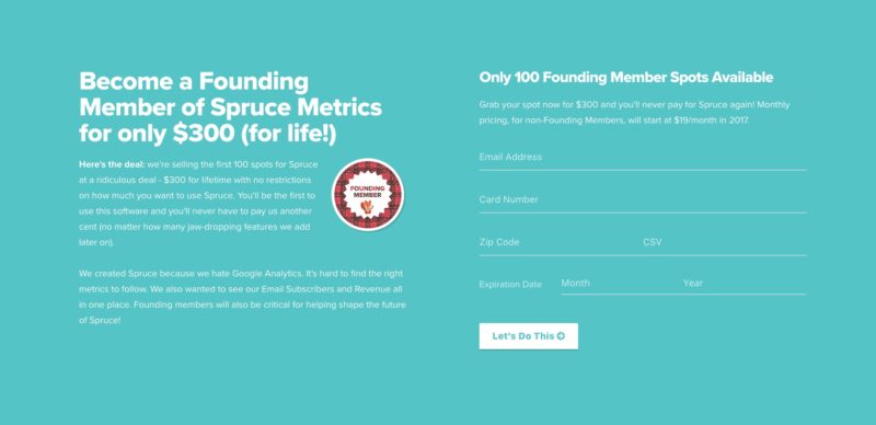
We’re still hoping to reach this milestone. I’ve already started coding the page where people can buy. However, it’s not hooked up to a payment platform. Here’s what it looks like:
This page will replace the pre-launch page we have now at SpruceMetrics.com for a limited time. I plan to promote this hard!
Moving To WordPress
On November 6th, the three of us jumped on a Skype call to discuss the wizard and founding member page. We came up with an idea that I’m mad we didn’t think of before.
This whole time I’ve been designing the pre-launch pages in Rails, and deploying to Heroku. We thought, why not just move all the front-end consumer sales stuff to a WordPress install?
I already have an account with WPEngine (it costs me $600/mo and I get 25 WordPress installs).
I moved the pre-launch landing page code to WordPress and configured the domain with GoDaddy. Now www.sprucemetrics.com points to our WordPress site, and app.sprucemetrics.com (subdomain) points to the Heroku app.
Duh!
This allows me to work much faster on all the Spruce marketing stuff since I’m VERY familiar with WordPress and PHP. It will also function well for our support site when it’s time to build that.
Really pissed we didn’t think to do this earlier, but it’s done now.
What’s Coming Up After Election Day?
Tomorrow is Election Day. Who knows what’s gonna happen. Hopefully America doesn’t go apeshit, that way, we can continue to develop 🙂
I'm shaving my #beard after #ElectionNight. Unless Trump wins, then I'm keeping it and moving deep in Rocky Mountains. pic.twitter.com/Eegm6JK8we
— Matt Giovanisci (@MattGiovanisci) November 7, 2016
I’m kidding of course.
The plan is to hopefully launch version 1.1 of Spruce to a handful of alpha testers at the end of the week. Then, we launch the founding memberships, then we keep an eye on the software and improve.
During the next few months, Jason and I will be focusing on promoting and gearing up for the full launch in 2017.
We’re Launching This Week!
It’s been 90 days working on this project, and I admit, it’s been the toughest one I ever worked on.
But alas, we’re launching to a bunch of alpha testers and founding members this week, no matter WHAT!
The Pre-Launch Landing Page Results
The page has been live for a week. Everyone on the Money Lab list got an email about it. So did Jason’s list. That totals close to 15,000 people who heard about this page.
As of writing this, we got 307 signups. 48 of those email addresses came from people sharing.
The Pre-Launch To-Do List
Over the past few days since I got back from my vacation in the mountains, I’ve been preparing for the version 1.1 launch.
I worked on wiring up the “Founding Members” payment page in WordPress. This page will replace the pre-launch landing page for a few weeks as we get paying “Founding Members.”
I learned how to hook up Stripe to the form on this page. The life-saver was code that I got from Jason’s friend Zack. It saved me from a stress-filled week.
Here’s the way it works:
- You enter your email and credit card info.
- Stripe processes the payment through an Ajax script (so you never leave the page you’re on).
- If successful, the payment form gets replaced by a message that you’re a “Founding Member.” Since there’s only 100 spots available, it also keeps track of how many spots are left.
- Your email gets added to Mailchimp and you’re sent a message with details on how to create your account.
We plan to launch to “Founding Members” on November 16th 2016. The emails are ready to send. The marketing pages are ready, too. I hope the app performs well, and I have faith it will.
New Changes to The Spruce App
As I mentioned before, we moved the app to a new sub-domain, and we’re still hosting it on Heroku. Thai spent some time generating a SSL certficitate before launch.
Now we have an https for the app and the main site for user protection and SEO.
1. Wiring The Wizard
It’s important for us to have a wizard walkthrough of adding a website to Spruce. Everything we’ve built so far has been under the assumption that a user will know what to do when they start. But assumptions like this are terrible in software development.
Building the Wizard has been the number one reason for us pushing back the launch date in recent weeks. It was a giant undertaking at the last minute. And Jason has been adamant about having it before anyone sees it. Thai and I both agree.
I built a few HTML pages for it a while back. It was part of the redesigning of Spruce. But I failed to build the FULL workflow. This caused some bottlenecks in Thai’s development.
I had to dive back in and design some more pages to help connect the flow. I filmed a video for Thai to work with that is a crude demonstration of how it should work.
2. Improving The Wizard
Thai blew both of us away when he finished the Wizard wire-up in record time. It was a Saturday morning, Jason and I got to walkthrough the Wizard without any help and it worked.
But now that we got to see it in action, a slew of other improvements came up. These improvements were important for continuing the use the Wizard, not just cosmetic.
We asked, “what happens if you’re already connected to an existing integration?” What would that look like?
Jason and I jumped on Skype to think through the problem in a shocking 15-minute chat. That’s the shortest chat we’ve ever had!
I added some more dummy HTML to the Wizard pages.
We also added some cosmetic improvements, which is my job. Now that we can see the process in full, it made sense to add a loading screen.
3. Cosmetic Improvements
I happen to be particularly proud of this feature. After you integrate with a 3rd party app like Google Analytics or Mailchimp, you have to connect it to a Website.
For instance, I have two websites: SwimUniversity.com and RoastyCoffee.com. These are both in Spruce.
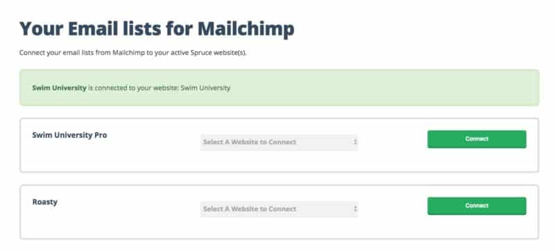
I use the same Mailchimp account to run these sites, but there’s two different lists. Once I’m integrated with Mailchimp, I have to connect the list to the website. When this happens, Spruce automatically pulls in all the data for the last 12 months (subscribers and unsubscribes).
This takes time to run this script. So we’ve added a loading screen to let people know to be patient after clicking the “Connect” button.
It’s uses a simple Jquery function to call a CSS overlay screen when you click the connect button. I filmed a video to show how this would work when you click a link. This was to show off what I’ve done to the team.
Believe it or not, the animation is CSS only with some SVG background images.
I’m Beyond Ready
This week is gonna be crazy. I expect I’ll be more public on social media while this thing gets launched.
If you’re excited and want to be a Founding Member, sign up for the pre-launch list right now!
Also, I’m not shaving until it’s launched. I REALLY want to shave!
https://www.instagram.com/p/BMzNNG8jGMT/?taken-by=mattgiovanisci
Launch Day!
We did it. We officially launched the first version of Spruce to paying customers. 🙂
That’s easy to say, but let’s walk through the moments that led to this. It started at the beginning of the launch week.
Problems With The Wizard
We had the app working. Then we added the Wizard and things went awry. Because of the structure we originally had, making the Wizard work properly challenging.
Thai was hammering the code while Jason and I tested. Sometimes you could get through the Wizard successfully, other times you’d run into an error. The bugs kept piling up in Asana and it seemed like we were adding Band-aids on top of Band-aids.
I was tired of seeing our 404 page with Rutherford.
This was the reason we did not launch on Wednesday like we wanted. The Wizard was fucked, and we had to make a quick decision.
To be honest, I was losing it. I was sad and angry. It didn’t look like we were going to ship…again. It was a rollercoaster of emotion and I didn’t have an outlet. The whole country seemed sad and angry, too, but for different reason.
Thankfully, Jason is a gifted motivator and has been talking me off the ledge. Though, I wish he would’ve just said…
Dude, you’re being a dick. Knock it off and suck it up.
I thrive on tough talk. Jersey strong I guess.
Last Minute Rollback
The day before the launch we all jumped on Skype. The Wizard wasn’t reliable, but we wanted launch.
I suggested to ditch the Wizard and film a walkthrough video instead. The app worked! It pulled in data from Google Analytics, Mailchimp, and Gumroad. You can see all your stats. It did EXACTLY what we wanted it to do.
But it’s not intuitive to set up for the user. And we had to deal with that.
We rolled back to the code to remove the Wizard. We spent time re-cleaning up some of the code and solidify it for launch. That meant making sure the design was up to date and everything worked.
We finished the app and got it ready for launch at about 9pm the night before. But now it was up to Jason and I to get all the marketing stuff in place.
The Help Video
Now that there’s no Wizard to walk you through adding a website and data, I had to create a help video. I drank a glass of wine, cleared the database, and started recording myself adding a website using screenflow.
The video was over 20 minutes! I walked through EVERYTHING. But it was too long.
I thought it would be a nice touch to film myself introducing the video with my Spruce beard (which I get to shave today!). I tried to make it funny, but it was late. I had a lot of editing and uploading to do, so I couldn’t waste time getting it perfect.
Publishing The Payment Page
Last on our list was making sure people could pay for Founding Memberships. This is hosted on WordPress. We had it working a week ago on the staging server, but we needed to test it with real money.
I pushed it live, made a few code changes, and Jason bought two Founding Memberships (which we refunded of course). Everything worked!
Right before we ended the night, Jason sent an email to everyone in his BuyMyFuture group to let them know the software was ready to use. These people get Spruce for free by being a member of BuyMyFuture.
Checking real-time Google Analytics, it looked like about five or six people were signing up for Spruce and there were no bugs. Things were looking good.
Go for Launch!
Even though I stayed up WAY past my bedtime, I was still able to get up early (8am is early for me). I zombie-walked to the computer and jumped on Slack to prepare for the launch.
No public announcements had been made yet, but somehow we already had two Founding Member signups. Whoa and cha-ching!
Jason sent out the Founding Member Announcement emails to both the pre-launch mailing list (320 subscribers) and his list on JasonDoesStuff.com (a little over 12,000 subscribers minus anyone already on the pre-launch list).
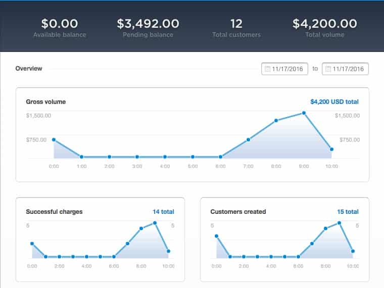
As of writing this at 10:39am on November 17th 2016 (Spruce Founding Member Launch Day) we’ve had 12 new Founding Members signup for Spruce! That’s less than 2 hours after we sent the emails!
You’ll notice the “Total Volume” is higher than “Pending Balance.” That’s because it includes the two test purchases Jason made (and then refunded himself) the night before. But the 12 “Total Customers” number is accurate.
Note: The “Founding Members” offer ends on December 1st 2016. We’re hoping to get 20-30 members.
What’s Next For This Challenge?
I will continue to update this challenge with real numbers. But I’m working on writing a wrap-up. What I’ve learned and what’s next for Spruce.
I will say that we plan to completely rebuild Spruce from the ground up on a different platform that we haven’t decided on yet.
Our plan is to launch Spruce to the public in January for $19/month. But if you want to start using Spruce right now, get yourself a “Founding Membership” which give you lifetime access to Spruce, and you’ll never have to pay for it again.
Get your Founding Membership here for a limited time only: https://www.sprucemetrics.com/
The Final Recap
This was the hardest Money Lab challenge. It’s the hardest project I’ve EVER worked on in my entire adult life. And this comes as no surprise.
I knew that learning a programming language was difficult, but I wanted to challenge myself. Not just for the sake of the story, but because I wanted to learn. I’ll admit the story was a driver, too.
I wanted to prove it was possible for anyone to build an app, but I didn’t do that. Programming is fucking hard and requires a certain type of person.
Building an app like this requires you to be completely immersed in the programming world, not just a tinkerer. If I had chosen a different app to build, this wouldn’t have been a difficult challenge.
The beginning of this project was fun. I was learning a new language. I would type some characters and see cool results. But then things took a turn for the worse.
I got in over my head. I was dealing with APIs and complex coding principles. I knew that I wasn’t going to be able to finish this project with the limited skill set I had acquired in 30 days.
I learned some valuable lessons. I learned about myself. My flaws were amplified, and the artist in me lost his shit. But the project was successfully nonetheless.
How Much Money Did We Make?
First, let’s talk about how much was spent on this project.
- Treehouse Membership: $25/month
- Logo Design: $125
- Practical Object-Oriented Design in Ruby Book: $25
- Intercom: $49/month
- ScreenFlow for Mac: $34
- Mailchimp: $10/month
- WPEngine: $29/month
- Heroku: $9.83
- godaddy: $12.17
Since I already pay for Mailchimp and WPEngine for my other projects, I used the base price of what it would cost for a single project to determine what we pay per month for now.
So far we’ve spent $432 on this project. All the monthly expenses were calculated for two months.
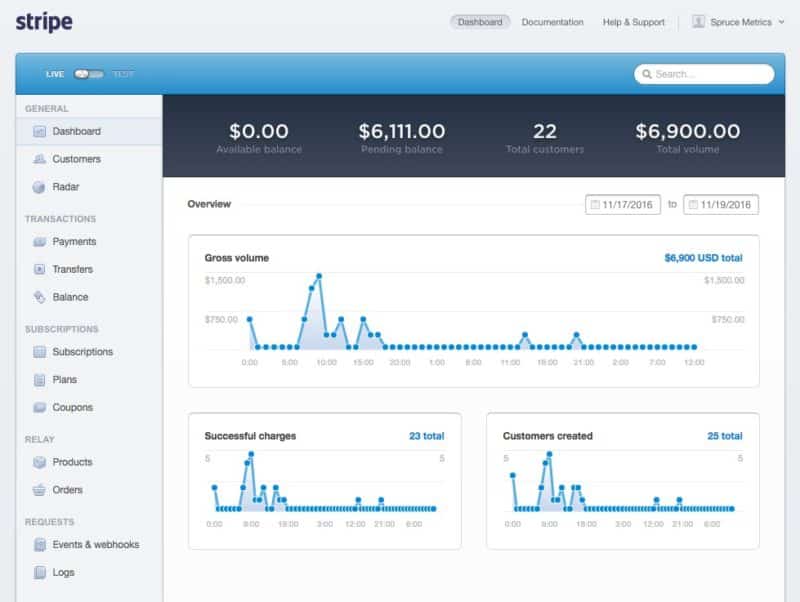
The good news is, on our “Founding Members” launch day, we made $6,111.00 on 20 customers. This is the most money any challenge on Money Lab has made on launch day. Success!
This is only two days after the launch. The Founding Memberships are on sale for another 12 days, and we’ll be promoting that.
What I Learned From This Challenge?
The lessons learned from the last 90 days could fill a fucking book. But I’ll be brief.
Programming is hard. I tried, and I will continue to try, but it’s a difficult skill in high demand. Now I know why programmers get paid well. It’s tough.
I should have hired a programmer from the start. Hindsight is 20/20 and this is crystal clear to me now. Sure, it was fun to try (and stressful), but this project was bigger than I thought it would be and I needed help.
I’m an emotional dude. I lost my shit a couple of times. I was sad, depressed, angry, in denial, and that had NOTHING to do with the election results!
I mentioned early in this challenge that I don’t work well on teams. I knew that going in and I tried to fight that notion. But it came out anyway. I will continue to fight it though!
I have very supportive friends. This one goes out to Jason. He kept me off the ledge and sent encouragement when he knew I needed it.
Caroline (his kick-ass life partner) asked if I was annoying him. His answer was, “no.” Hahaha! Yea, right! I KNOW I’m a bastard sometimes, but he never got angry with me. He was my business therapist (which is what I need instead of a business coach).
Stephanie (my kick-ass life partner) is always supportive. She could also commiserate with me at times on building software since she’s done it before.
Communication is important. That sentence SUCKS. Communication is fucking crucial!
Not just talking to one another on your team, but overly explaining your thoughts and feelings. Sometimes I can be short with people if I’m not happy. That isn’t helpful for anyone. I need to wear my heart on my sleeve instead of holding back and being a dick.
Say what you feel. Say what you think. Even if it feels shitty, it’s better than bottling up that noise.
When you let go, magic happens. I experienced this after Thai pushed a major update to the app. I saw my designs come to life like magic.
I bet this is way a cartoonist feels when their characters are animated by someone else. Imagine how Charles Shultz must have felt when he saw an animated Charlie Brown try to kick a football. My guess is he said, “whoa! that’s the shit, dawg!”
Thank You
This challenge had the most comments, the most customers, and the most support. I want to thank everyone who followed along and became a Founding Member of Spruce.
Thank you to Jason and Thai for making this possible with me. This project would not be possible without Thai specifically. He helped me when I was coding. We had not known each other before this, and he donated his time. Then he became a partner and got it all done with us!
To Jason and Stephanie, I’m sorry and thank you. I’m sorry for being a dick at times. I’m sorry for being angry and depressed and short. But thank you for supporting me through those times. You know I’m not an actual dick and that’s comforting.
I’ve had so much support from family and friends via social media, phone calls, texts and in-person meetings. I’ve learned so much and it has been an incredible experience despite the rollercoaster ride of emotions and stress.
What’s Next For Spruce?
I’m wrapping up this challenge. This post is over 12,000 words and it’s getting hard to type (WordPress is literally running at half the speed because of all the content).
But that doesn’t mean Spruce is over. I’ll be updating you on Spruce in other challenges and experiments. Currently we have an experiment running right now to produce epic content on Spruce you should read.
I also plan to publish more experiments in the Spruce ecosystem. These experiments will be equally transparent as this one, and I’ll keep you updated via email as well.
Peach out!
